ForeverSafe

How I made adopting a dog easier.
Role: UI/UX Designer, Visual Designer
Timeline: 3 Months (Jan - March 2023)

Overview

ForeverSafe is a dog adoption center dedicated to finding loving homes for abandoned dogs. This website is aimed to enhance the overall adoption process by simplifying the search for dogs, streamlining the adoption process, and fostering a sense of trust and connection between potential adopters and the center.

My Design Process

The Problem

Adopting a dog can be a stressful endeavor and most platforms do not make it any easier with their cluttered designs and confusing application processes. With this in mind I saw the need to provide a simpler and easier way of adopting a dog and getting the adopter to see the dog they want as fast as possible.

The Goals

1

Provide a seamless process of potentially adopting dog and explaining the steps the adopter must take.

2

Design a modern eye pleasing UI that encourages happy path user flows

3

Understand users needs and frustrations when it comes to adopting a dog

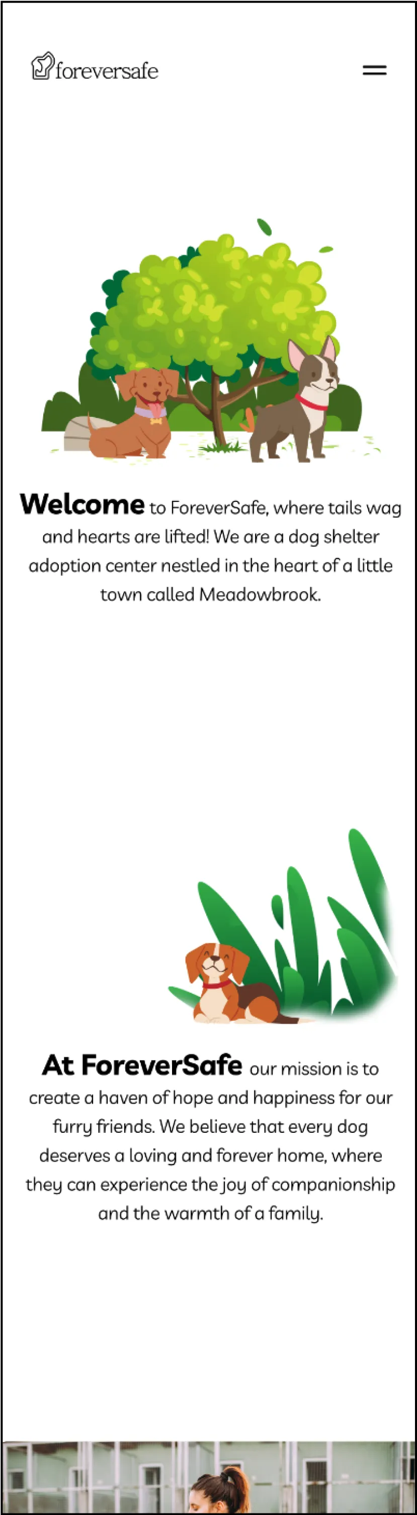
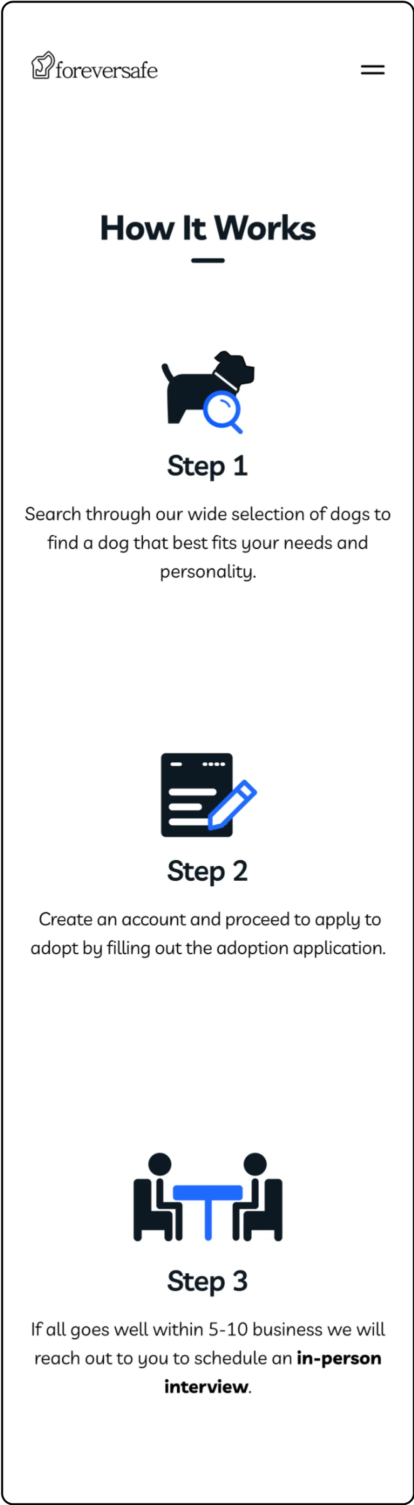
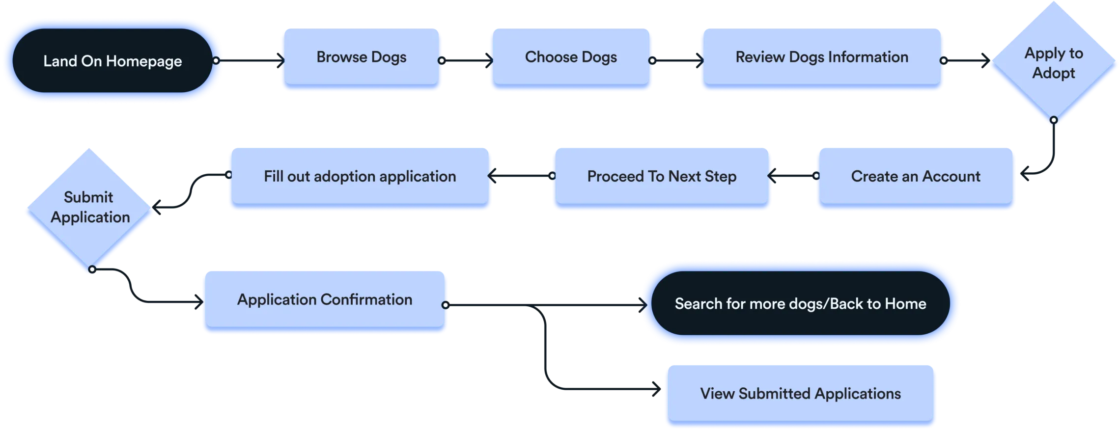
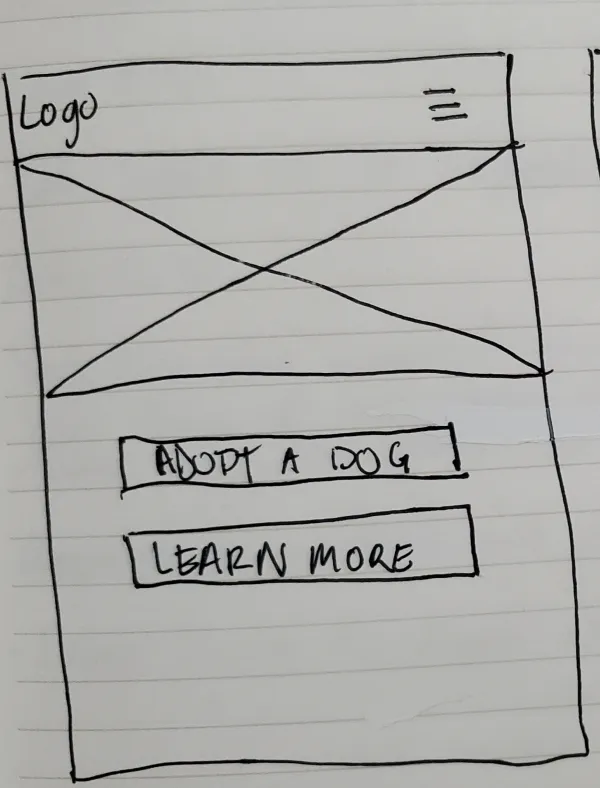
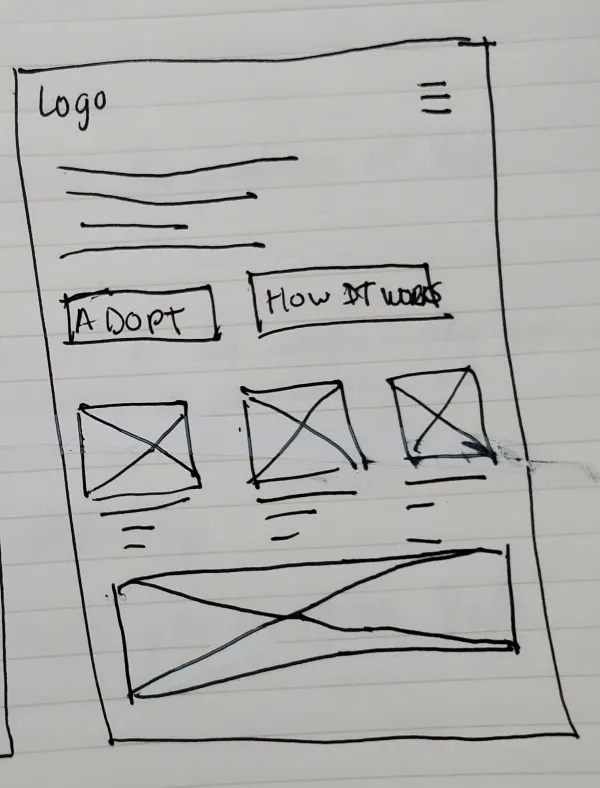
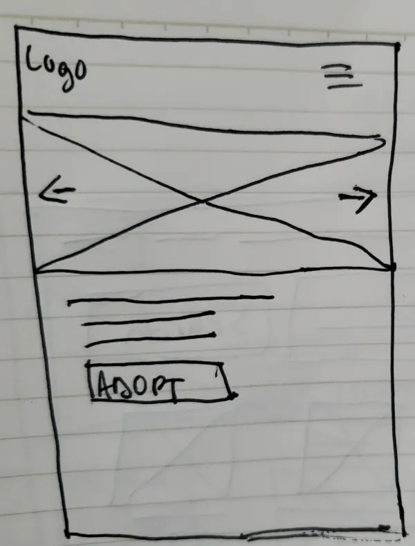
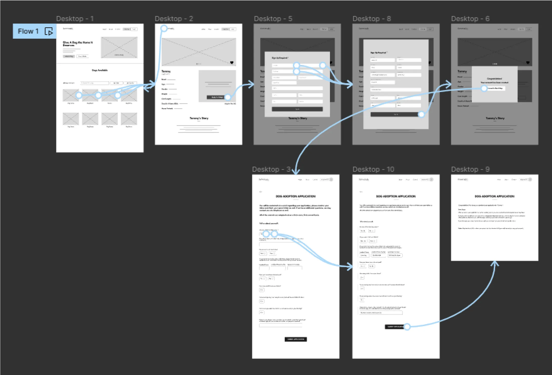
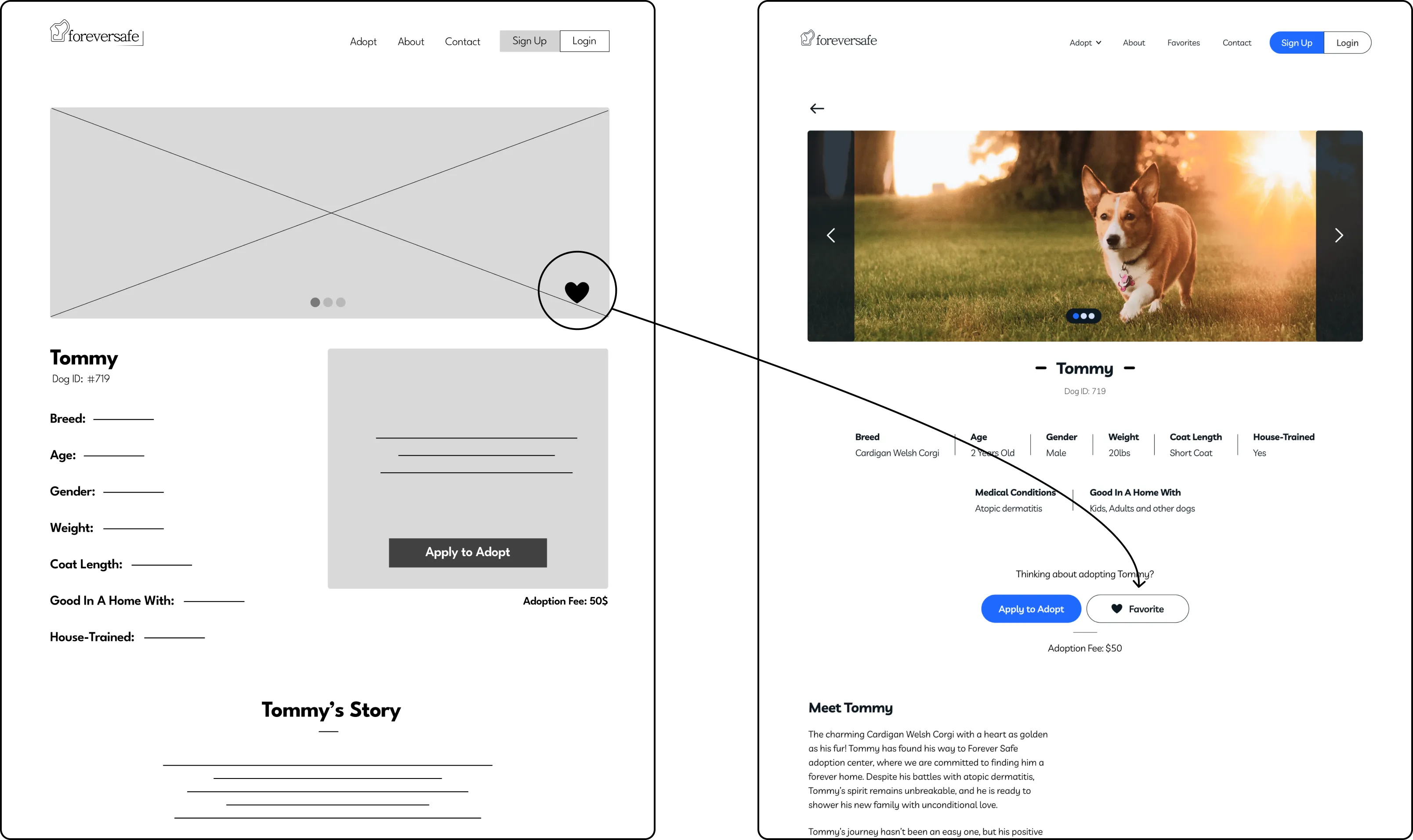
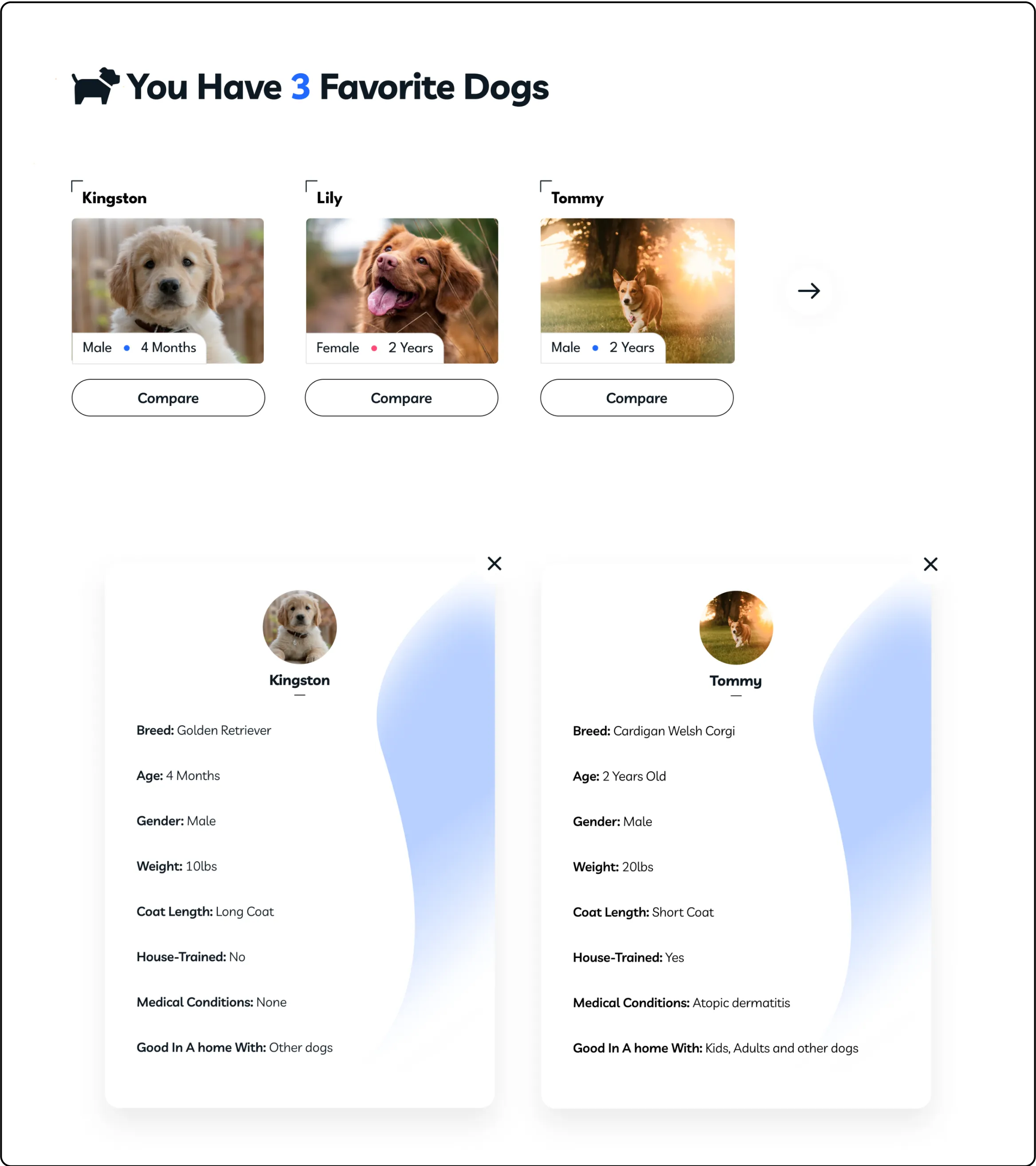
Understanding The User

In order to understand the user and their needs, I used qualitative research methods. This consisted of user interviews, personas, usability testing and user stories.

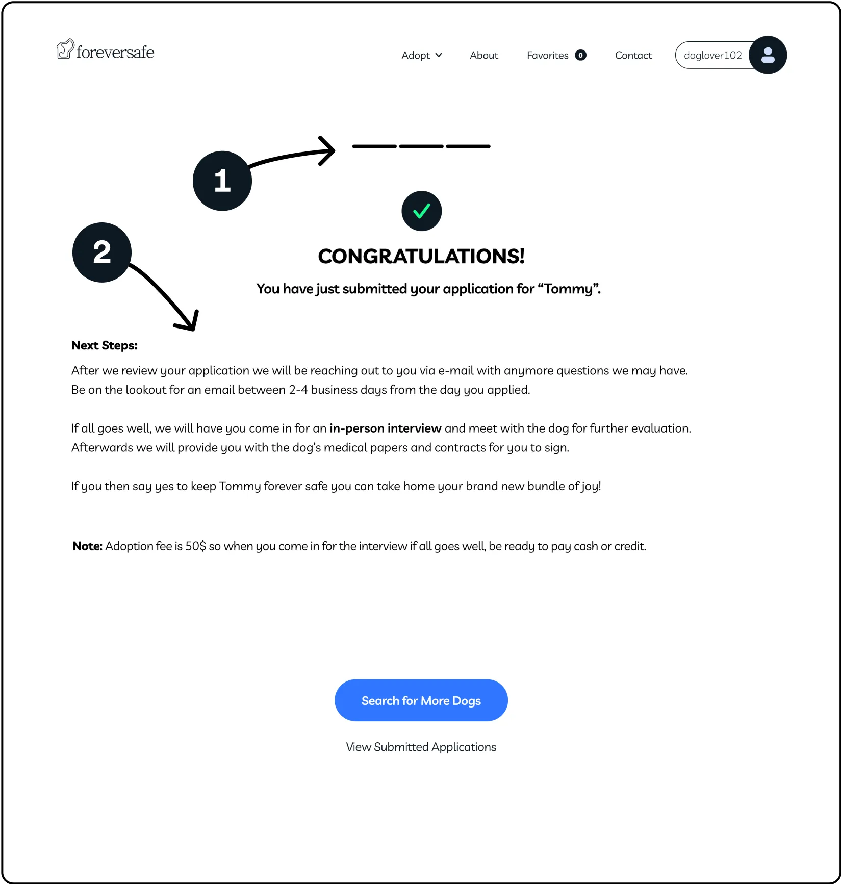
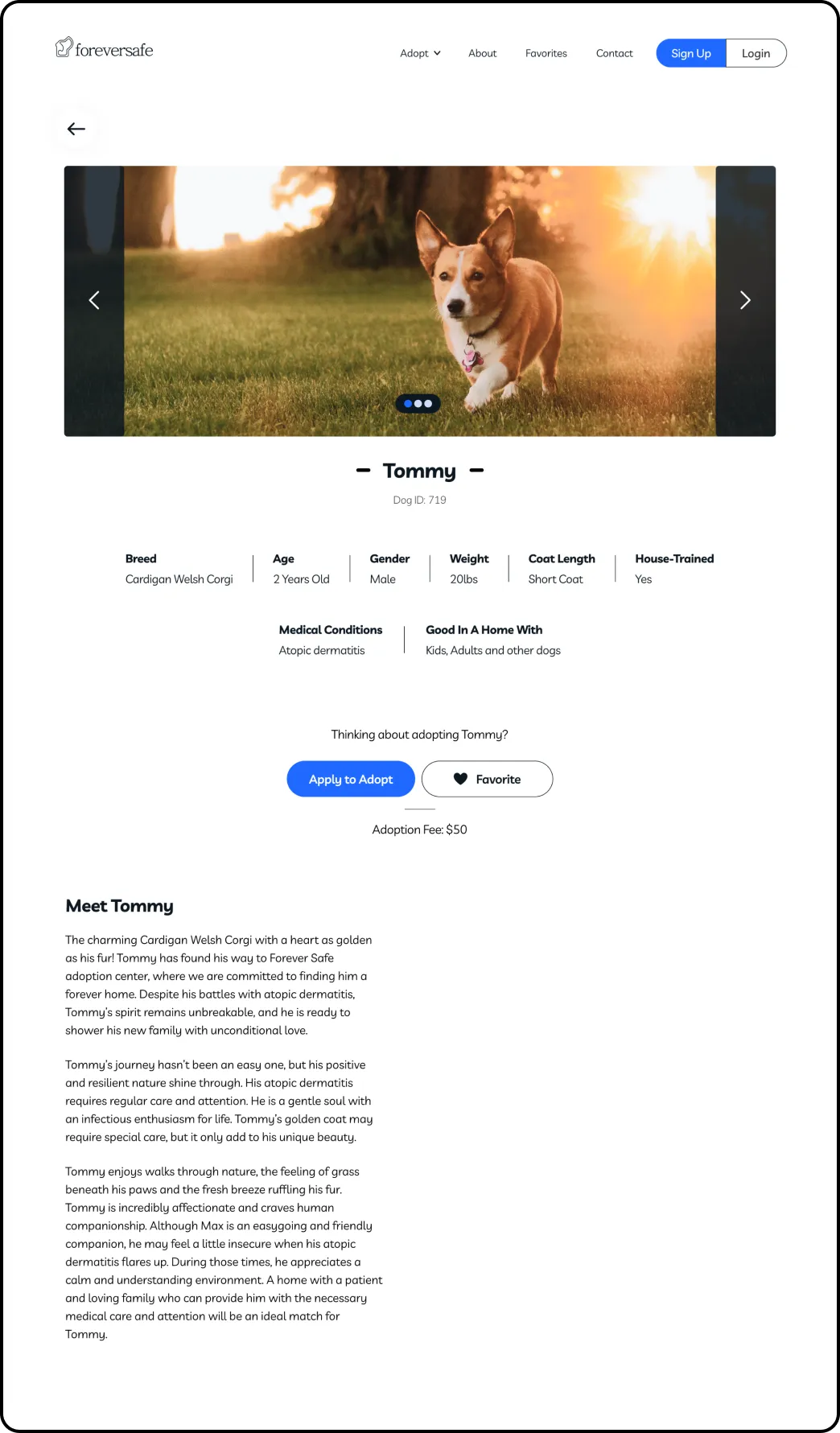
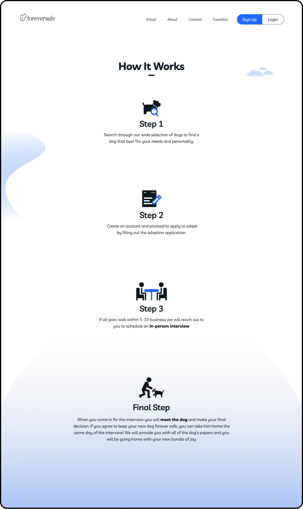
After my user interviews, I discovered that many target users are excited to adopt a dog but the excitement slowly fades away when the overwhelming process of adopting a dog starts. From not understanding the process and not having enough information about the dog, this causes users to not want to engage in adopting a dog.

User Pain Points

1

Interaction

Users are having trouble understanding the dog adoption process

2

Interaction

Users aren’t able to compare dogs they like with each other to make a more informative decision faster

3

Experience

Users dont have enough information about the dog to make their final decision

Persona:  Samantha

Problem Statement:

Samantha is a graduating student who needs detailed information about a dog and an easy to understand process because she finds the process of adopting a dog can be stressful.

User Flow Diagram

Since users in the past have had trouble with understanding the application process, my goal with the main user flow was to have as little steps as possible while also providing all the information needed to make an informed decision on what dog to adopt.

Starting the Design

After I empathized with users to define their users needs and pain points, I sketched out wireframes that I felt best addressed the users goals and frustrations.

Paper Wireframes

For the homepage I chose the paper wireframe that brought you to your dog search the fastest. I also worked on the designs for additional screen sizes to ensure responsiveness.

Digital Wireframes

I moved from paper to digital and added various elements to bring users to their desired dog more quickly and efficiently.

Desktop

1

CTA button to initiate the main user flow

2

Dog quantity transparency

3

Search function to quickly refine the users interests

4

Ability to favorite dogs

5

Background information about the dog and its personality

Mobile

Desktop

1

CTA button to initiate the main user flow

2

Dog quantity transparency

3

Search function to quickly refine the users interests

4

Ability to favorite dogs

5

Background information about the dog and its personality

Mobile

Low-Fidelity Prototype

After creating my low-fidelity prototype I was looking forward to begin testing. This prototype allows you to view the metronome and engage in live training for CPR.

View the low-fidelity prototype for: Mobile  l  Tablet  l Desktop

Usability Study

I conducted one round of usability studies with five participants to further discover pain points and user needs. I used a low-fidelity prototype for my studies and created affinity diagrams to synthesize my results and iterate on my designs.

Study Type

Moderated Usability Study

Location

New York, NY

Participants

5 participants

Length

10-20 minutes

Usability Study Findings

1

Interaction

Users wanted more medical information about the dog

2

Interaction

Users didn’t have a way to know what step they were in the process of adopting a dog

3

Experience

Users wanted a timeframe of when the in person interview will take place

Mockups

Based on the insights, I made changes to help the user in their decision of what dog to adopt by making the favorite button more visible and giving them the ability to compare dogs they’ve favorited to further inform their decision.

To make the adoption process easier to understand, I changed the copy to give users an estimated date of when they will receive an email. I also added a progress indicator to further emphasize that you have completed every step of the application process.

Final Designs

After gathering all of my user research through interviews, personas, usability studies, I started working on the final designs.

Throughout this, I considered various principles such as contrast, font size, scale and hierarchy which all helped me increase the accessibility of my website. providing an experience that was not only engaging but functional.

Visual Design

For the look of the website I decided to go for a bright, happy, bubbly modern tone. I wanted the website to feel like walking your dog on a beautiful spring day at the park. This influenced my choice on the font and colors and icons which gave a friendly and welcoming attitude.

High-Fidelity Prototype

My high-fidelity prototype features design changes made after usability studies addressing all user needs. Since users use the web from a variety of devices I created a mobile version as well so users have the most responsive experience no matter what device.

Final Desktop Designs

Final Mobile Designs

Takeaways and Next Steps

During this project I learned that just when you think you got the answer, there’s a user ready to show you why it doesn’t work and it’s time to go back to the drawing board.

After iterating the designs our target users shared that the design was simpler to navigate through and the process was much easier to understand than other platforms.

This confirmed to me that I accomplished the goals that I set to achieve in the beginning of this project. My next steps are to conduct more usability tests and identify potential areas that need could make the user experience even simpler.