
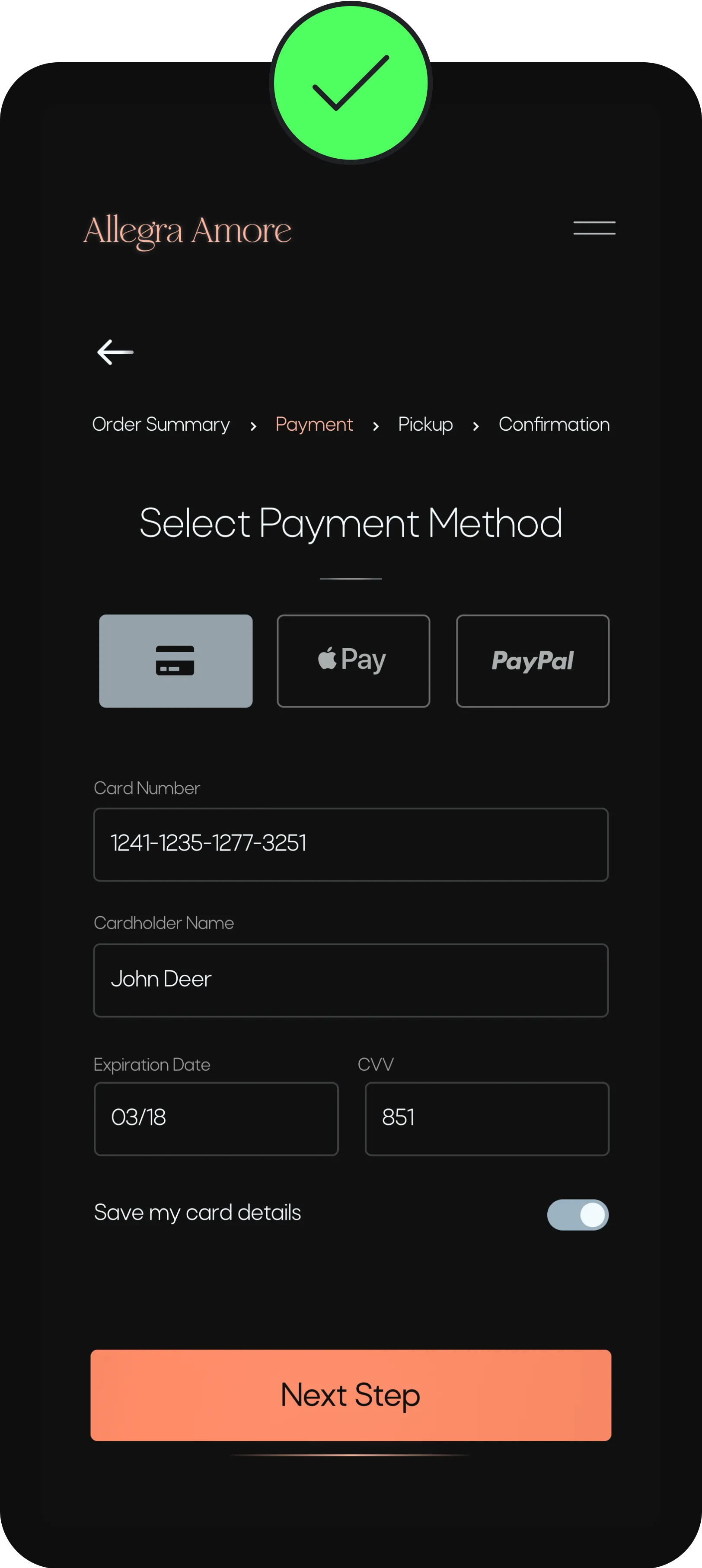
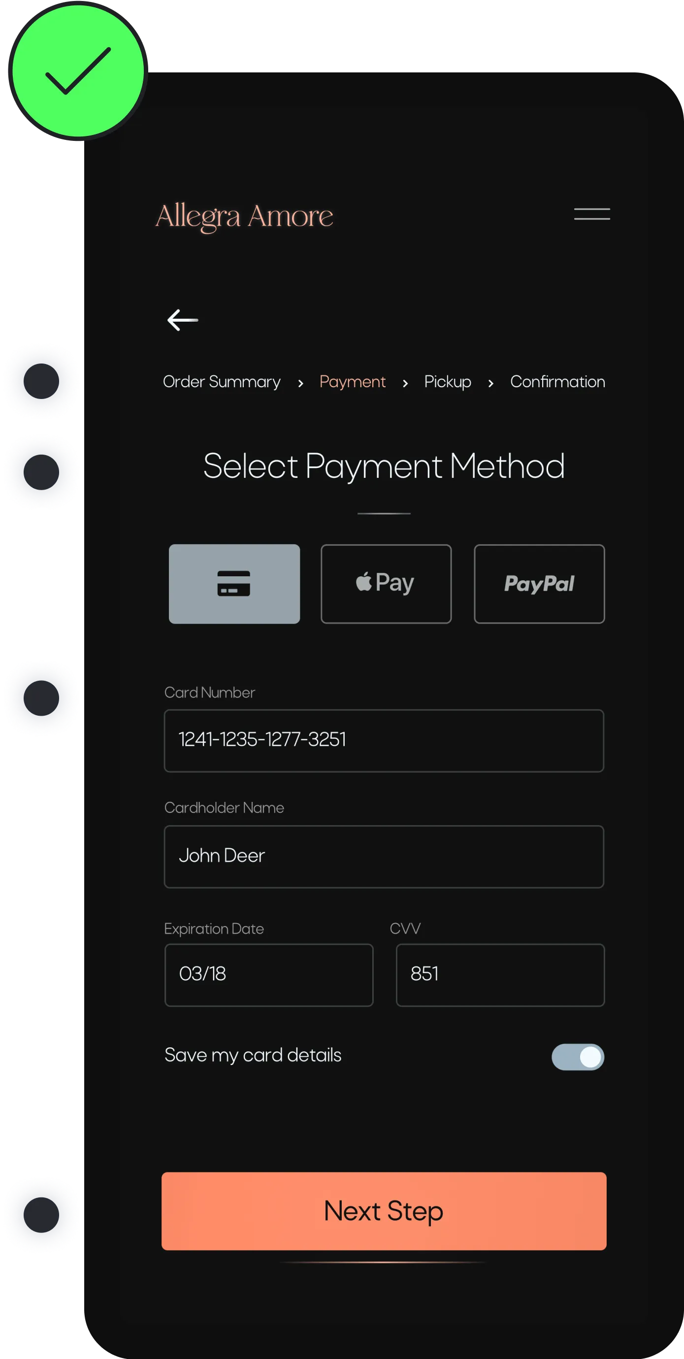
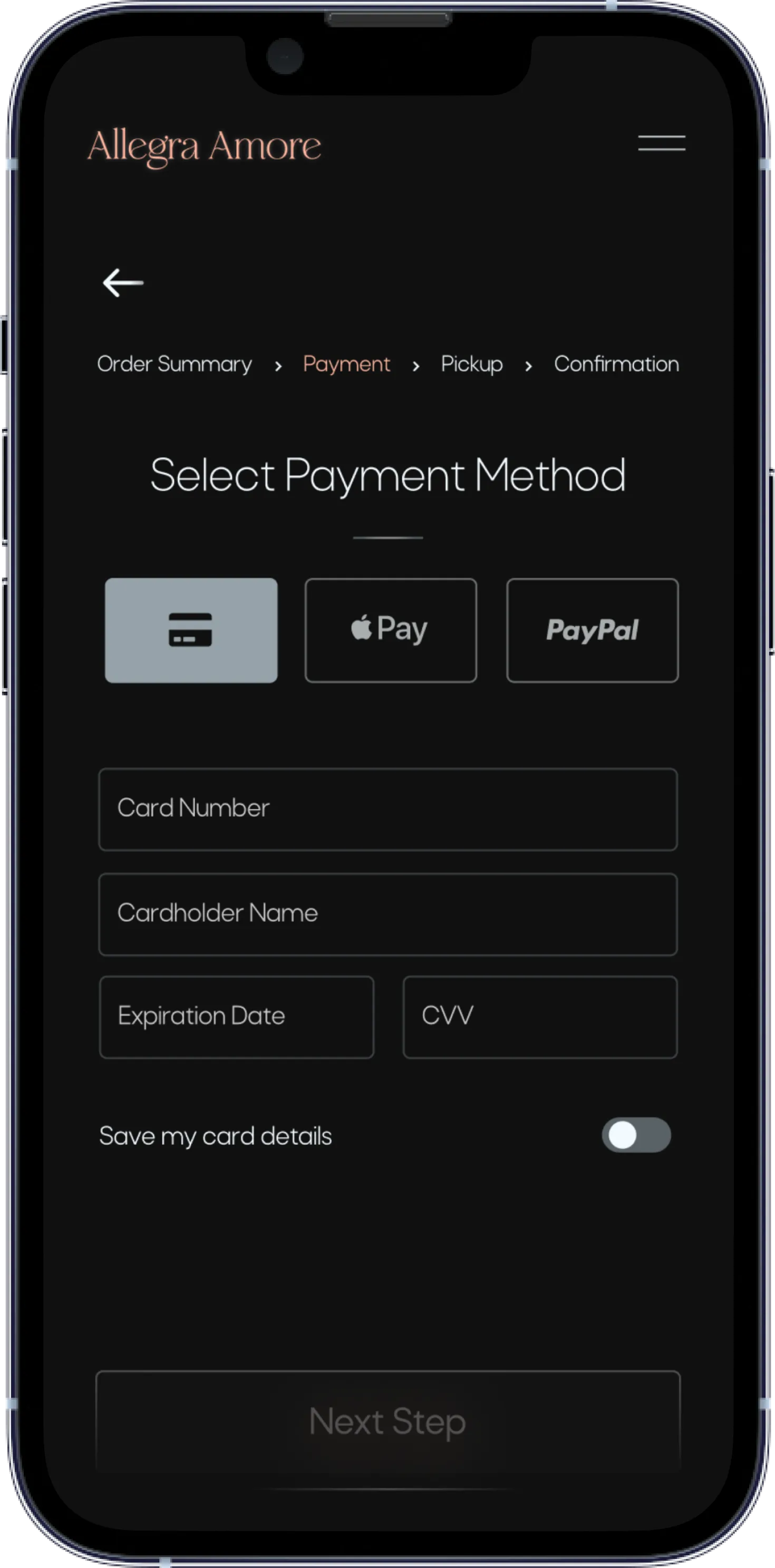
Most Participants were having trouble with the payment process


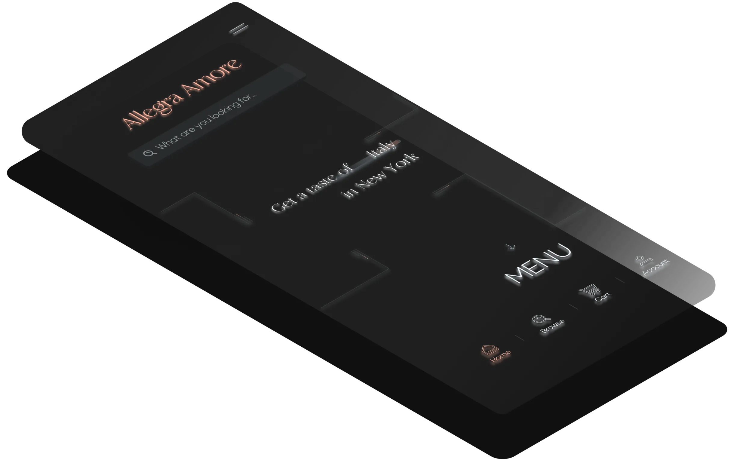
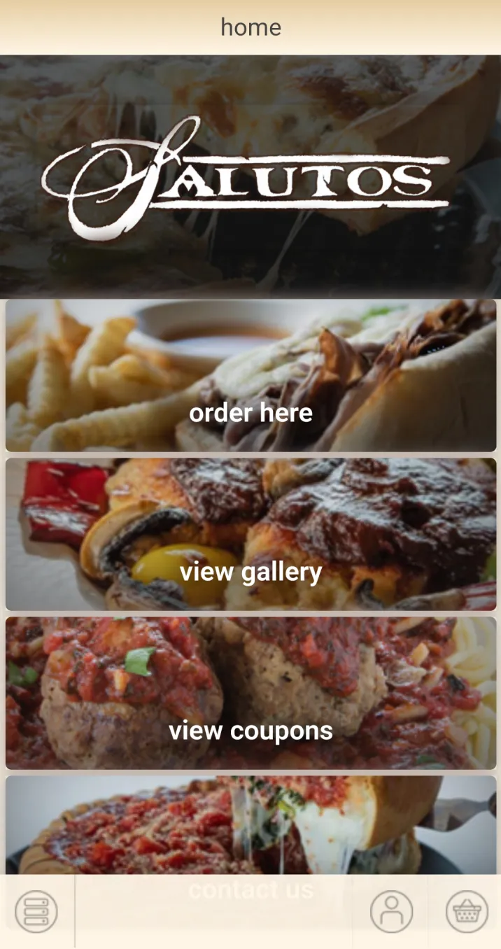
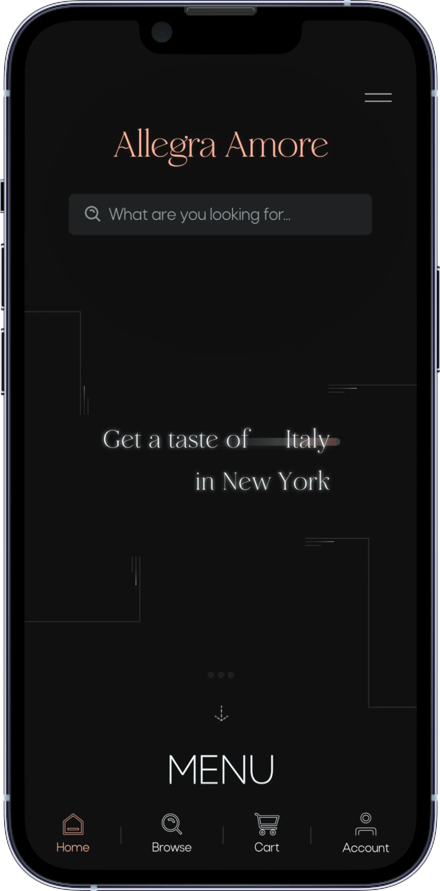
Allegra Amore is an Italian restaurant app that offers fast delivery and pickup services from the closest “Allegra Amore” restaurant near you. Allegra Amore was developed to bring accessibility and functionality to the experience of ordering Italian cuisine.
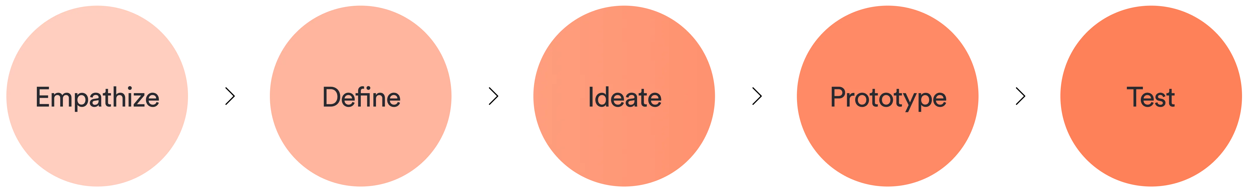
My Design Process
With not many options around Bronx, New York to easily order Italian food I saw the need to create Allegra Amore. People like my mother, who absolutely love Italian food and are not well versed in technology do not have an option that is easy and usable for them to order from.
From this I started my research on creating an app experience where my mother doesn’t have to ask me for help each time she wants fettuccine Alfredo.
Provide a seamless purchasing experience
Design a modern eye pleasing UI that encourages happy path user flows
Understand users needs and frustrations while making an order
Offer Spanish option
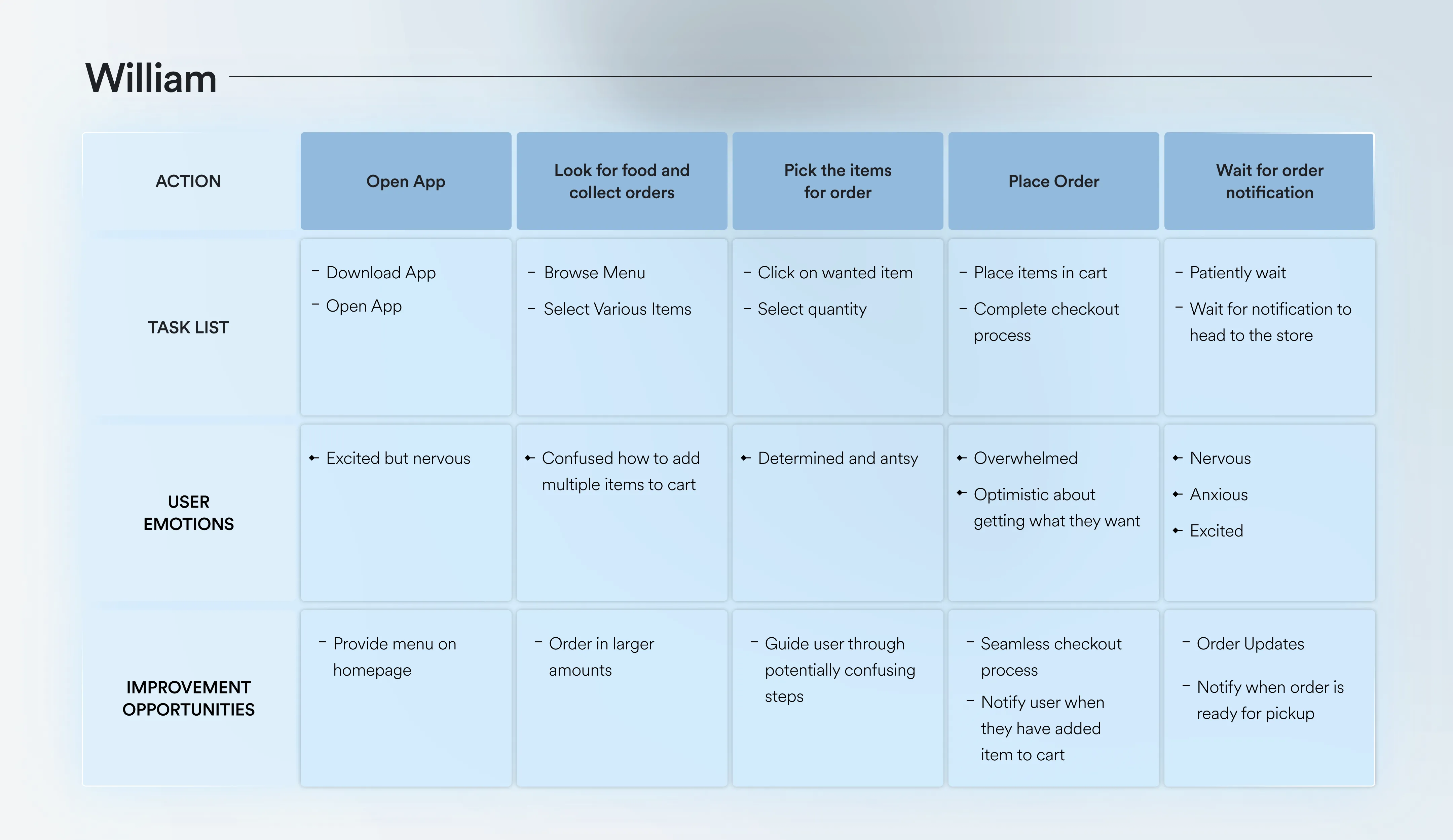
In order to understand the user and their needs, I used qualitative and quantitative research methods. This consisted of a competitive audit, personas, usability testing and user stories.
Going into my research I didn’t know what I was bracing myself for, but I was ready to discover. After conducting my research, the insights were fascinating and were the most useful on helping me iterate the app’s design into an easier experience.
I analyzed competitor’s app experiences which helped me to identify where they were lacking. This led to many opportunities for growth on my app.
Considering that users are looking for an easy-to-use app, the apps that I researched were not viable options for users.
The apps lacked design principles such as visual hierarchy, emphasis, proportion, scale, negative space etc. All of this combined provided a very inconsistent and confusing user flow.
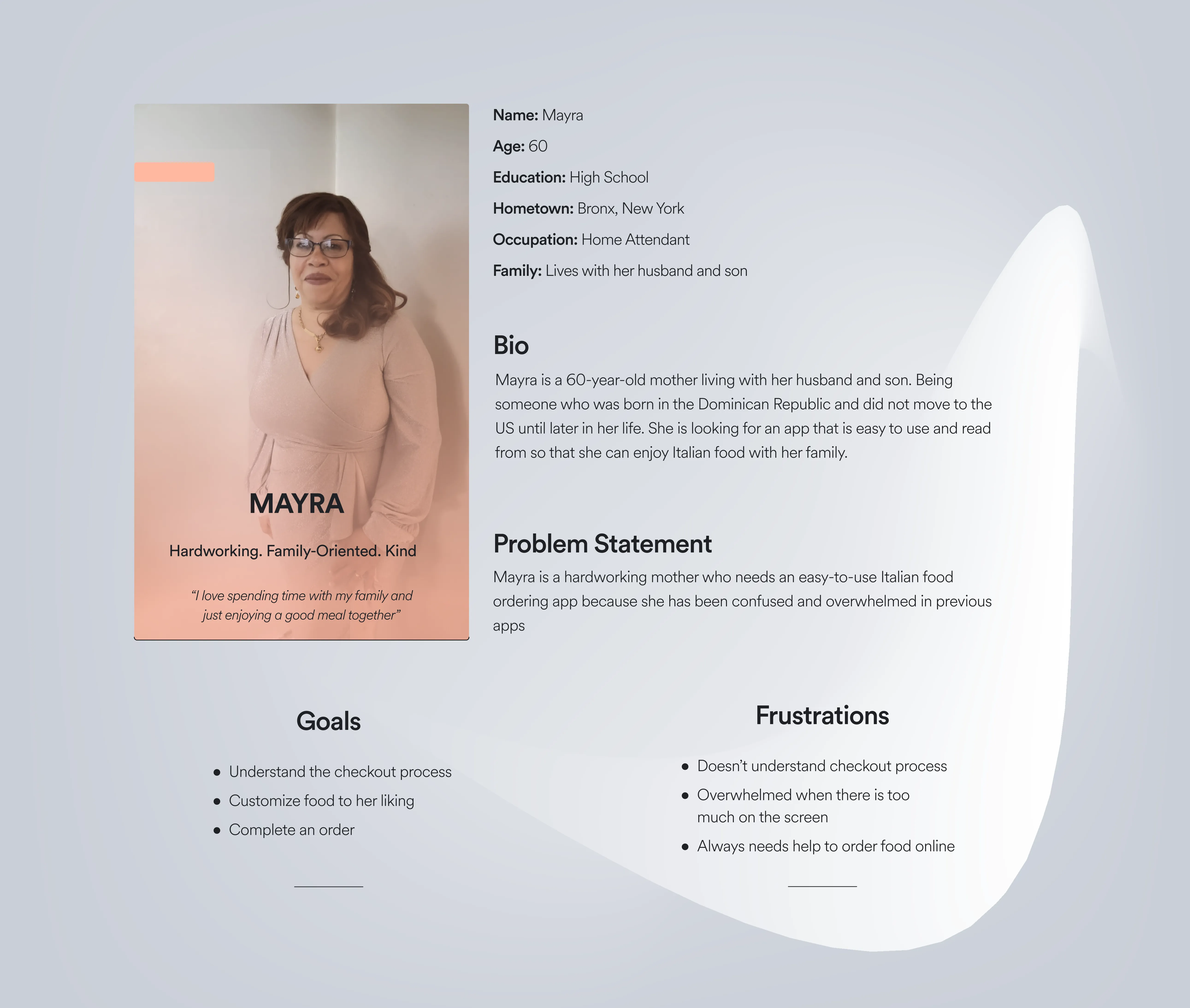
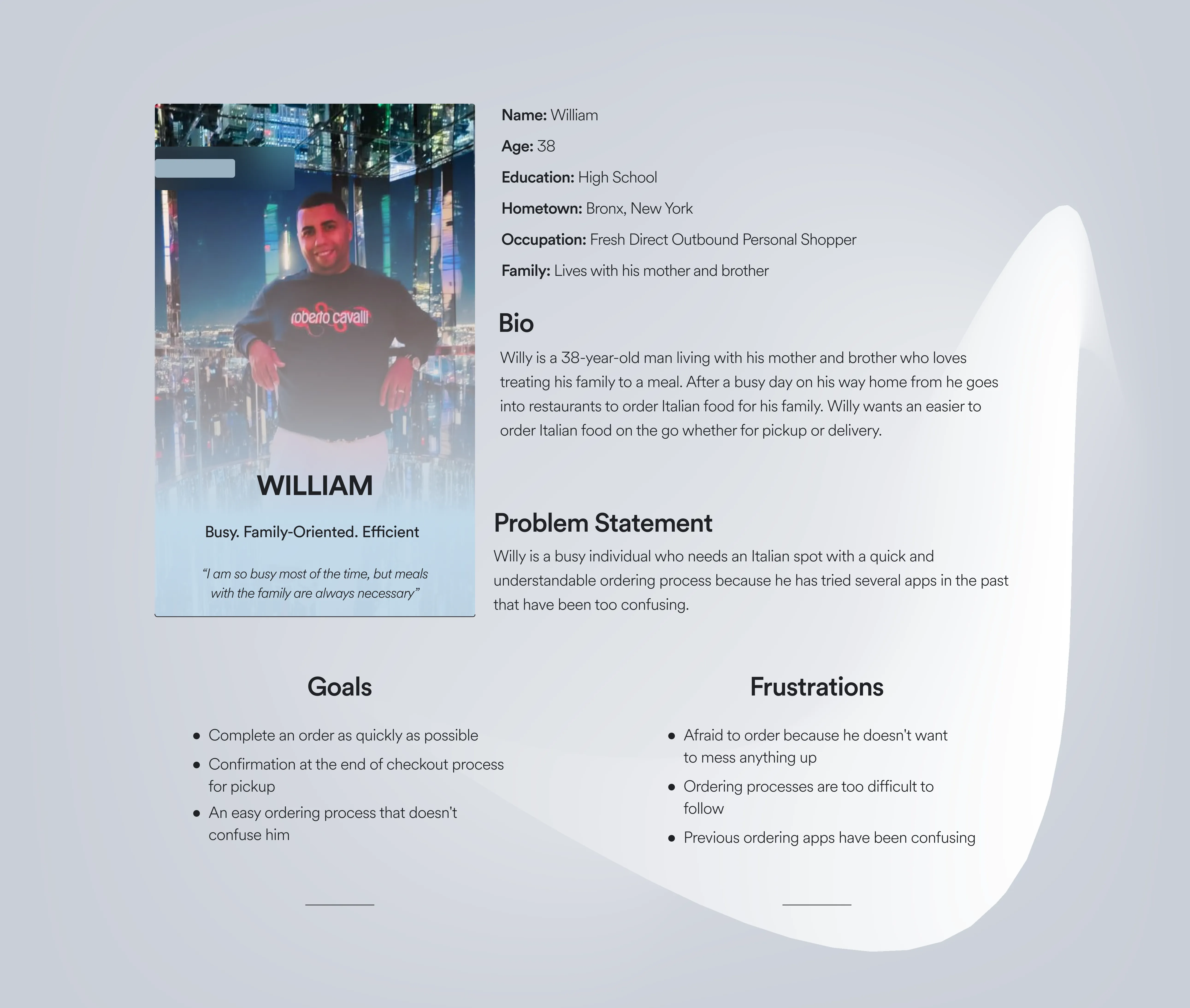
I created two user personas and journeys with different needs to help me empathize with potential users and their pain points.
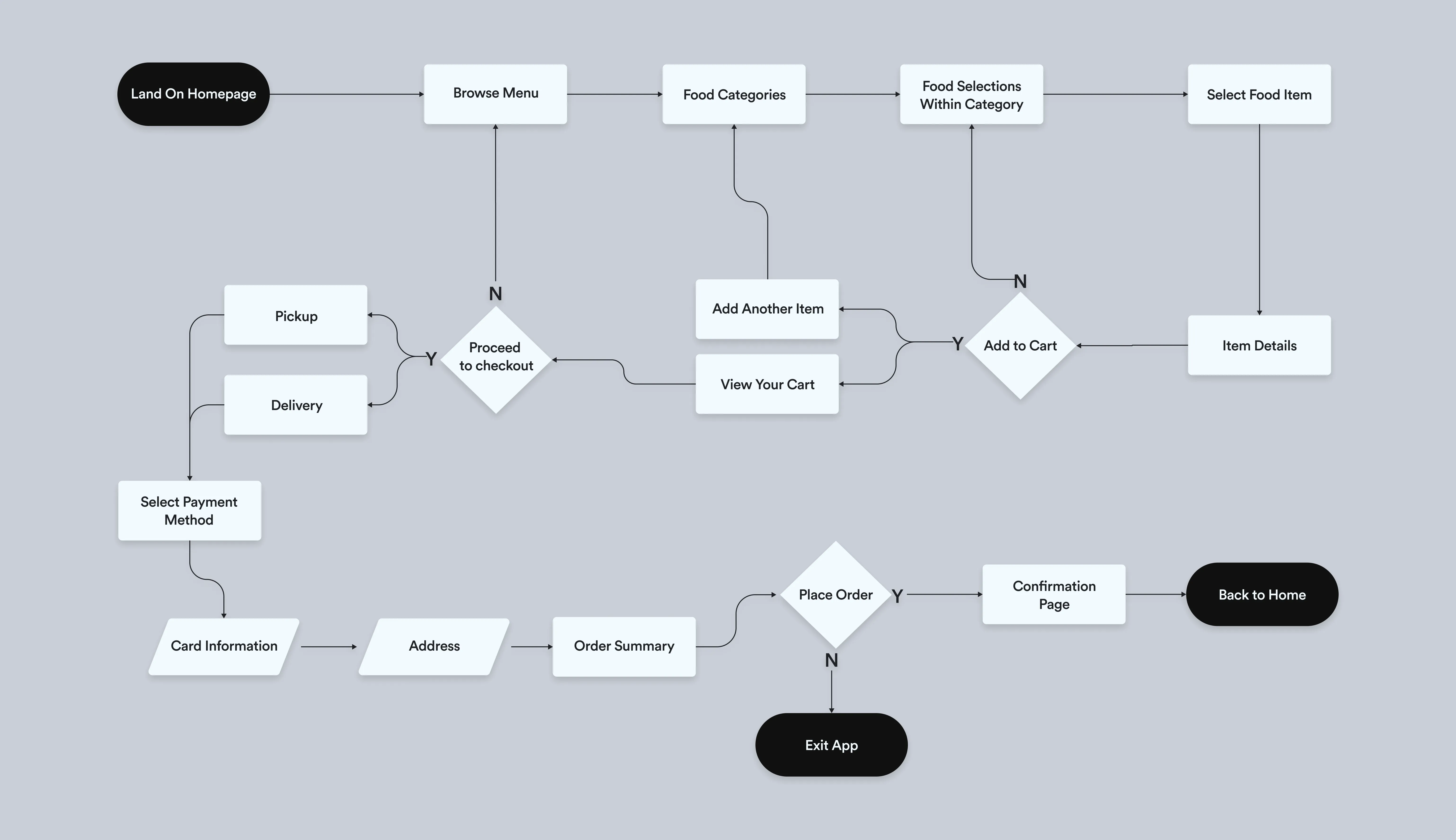
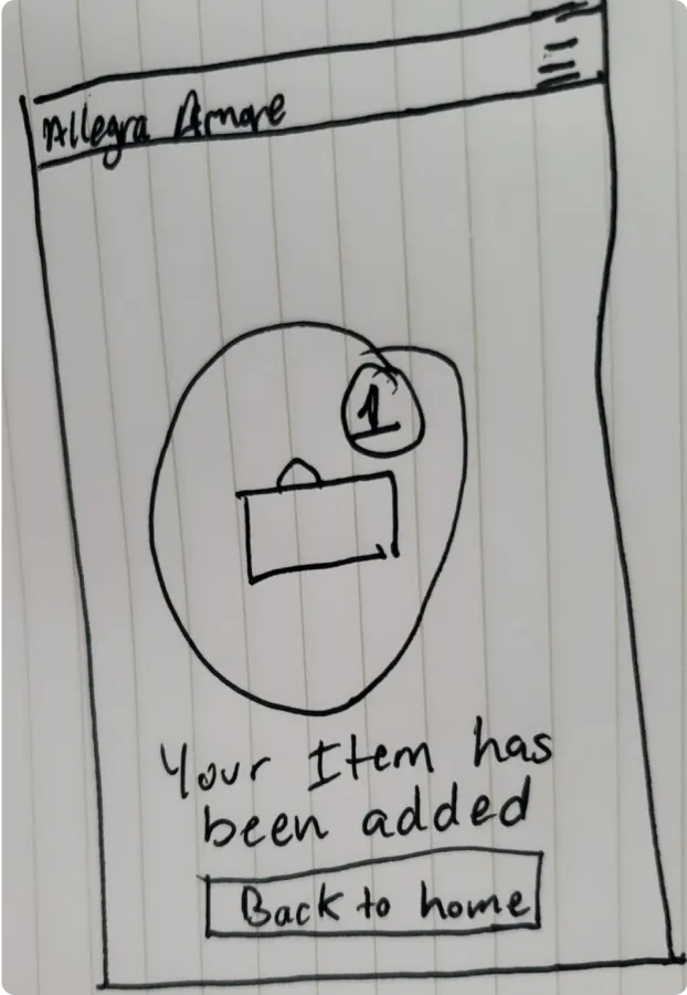
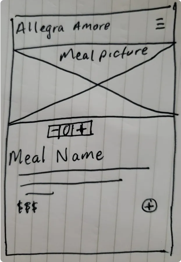
After I empathized and defined users needs and pain points, I sketched out wireframes that I felt best addressed the users goals and frustrations.
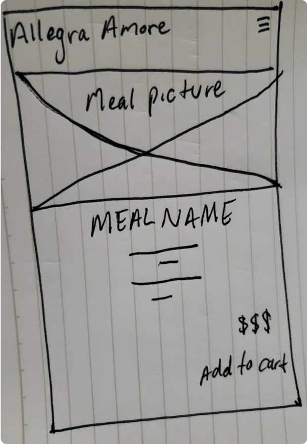
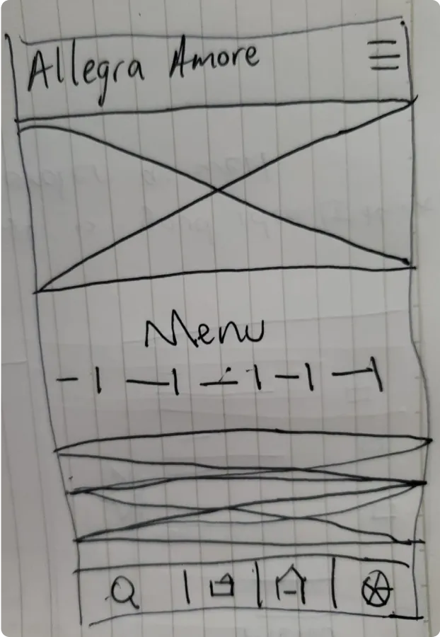
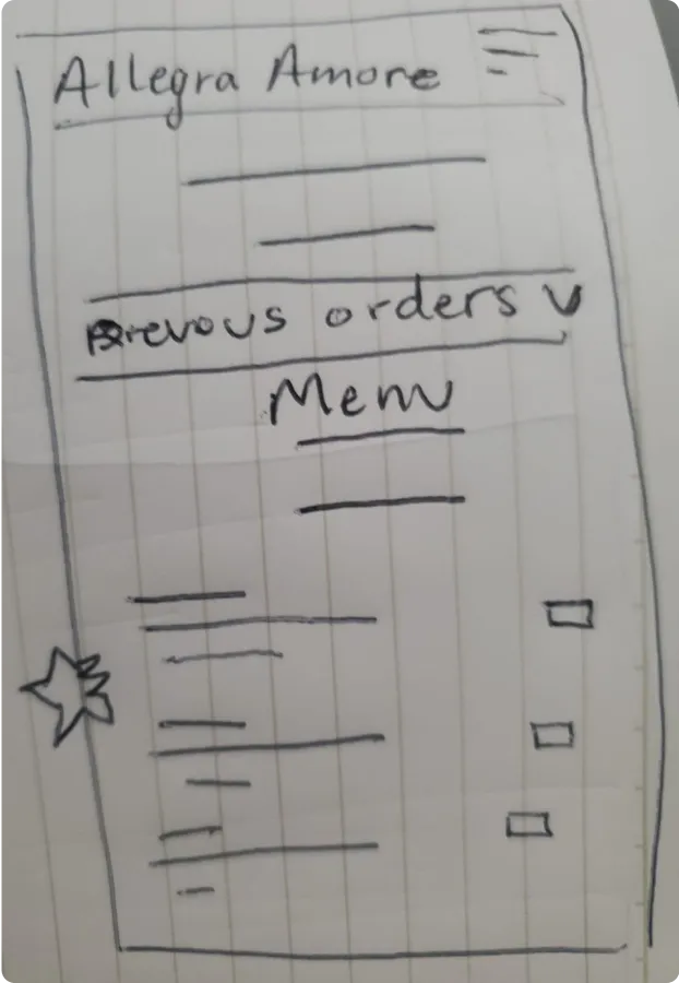
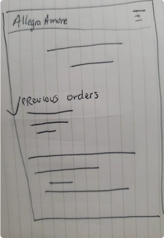
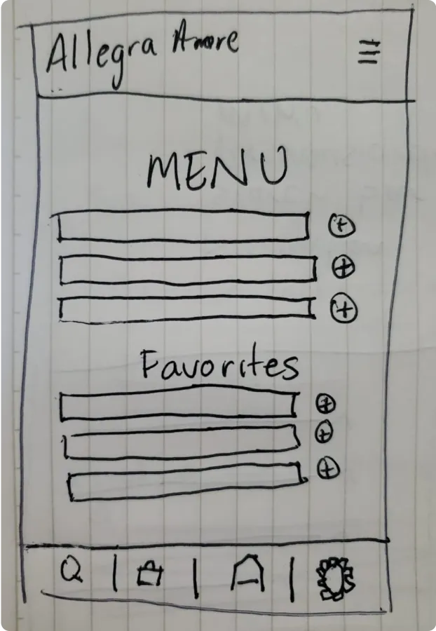
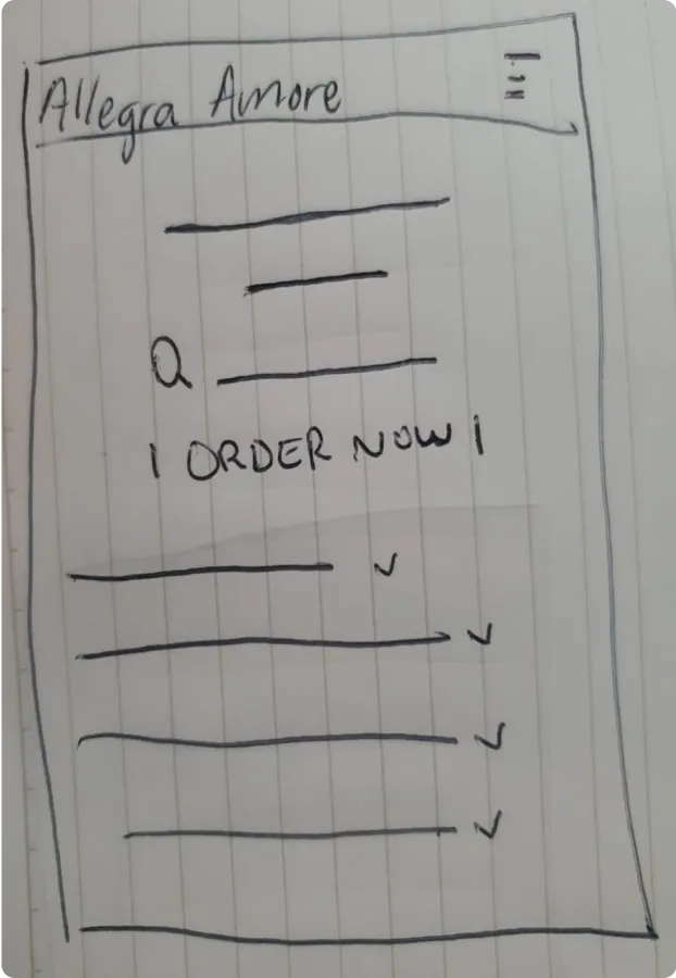
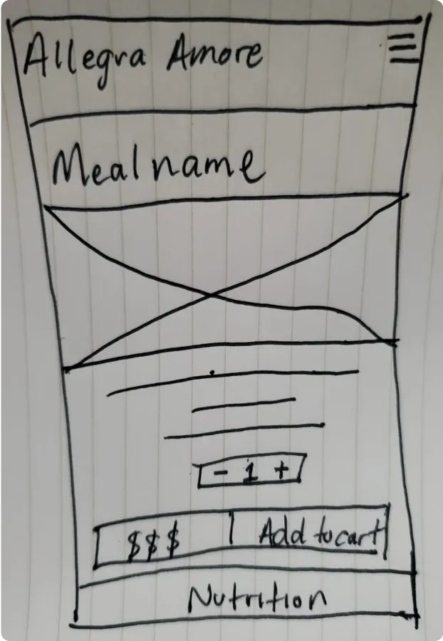
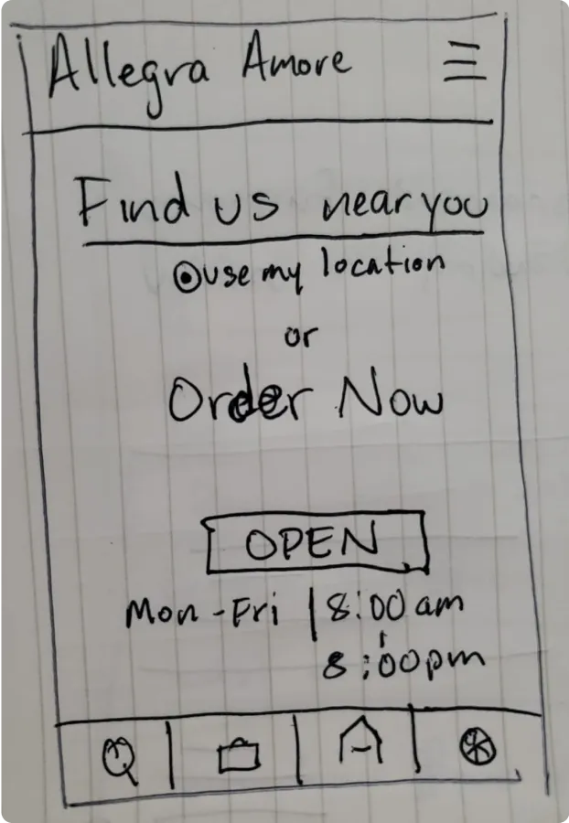
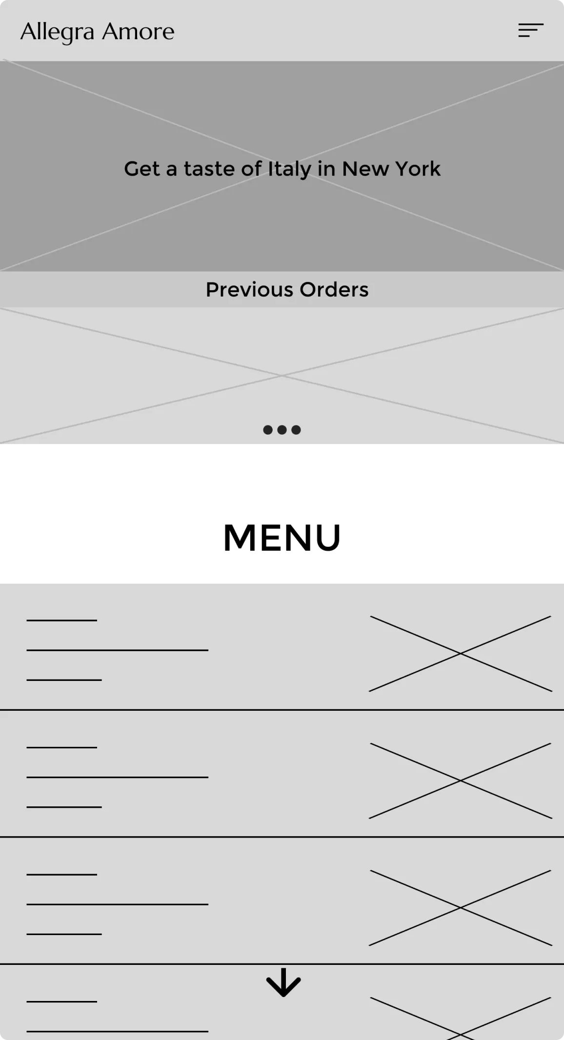
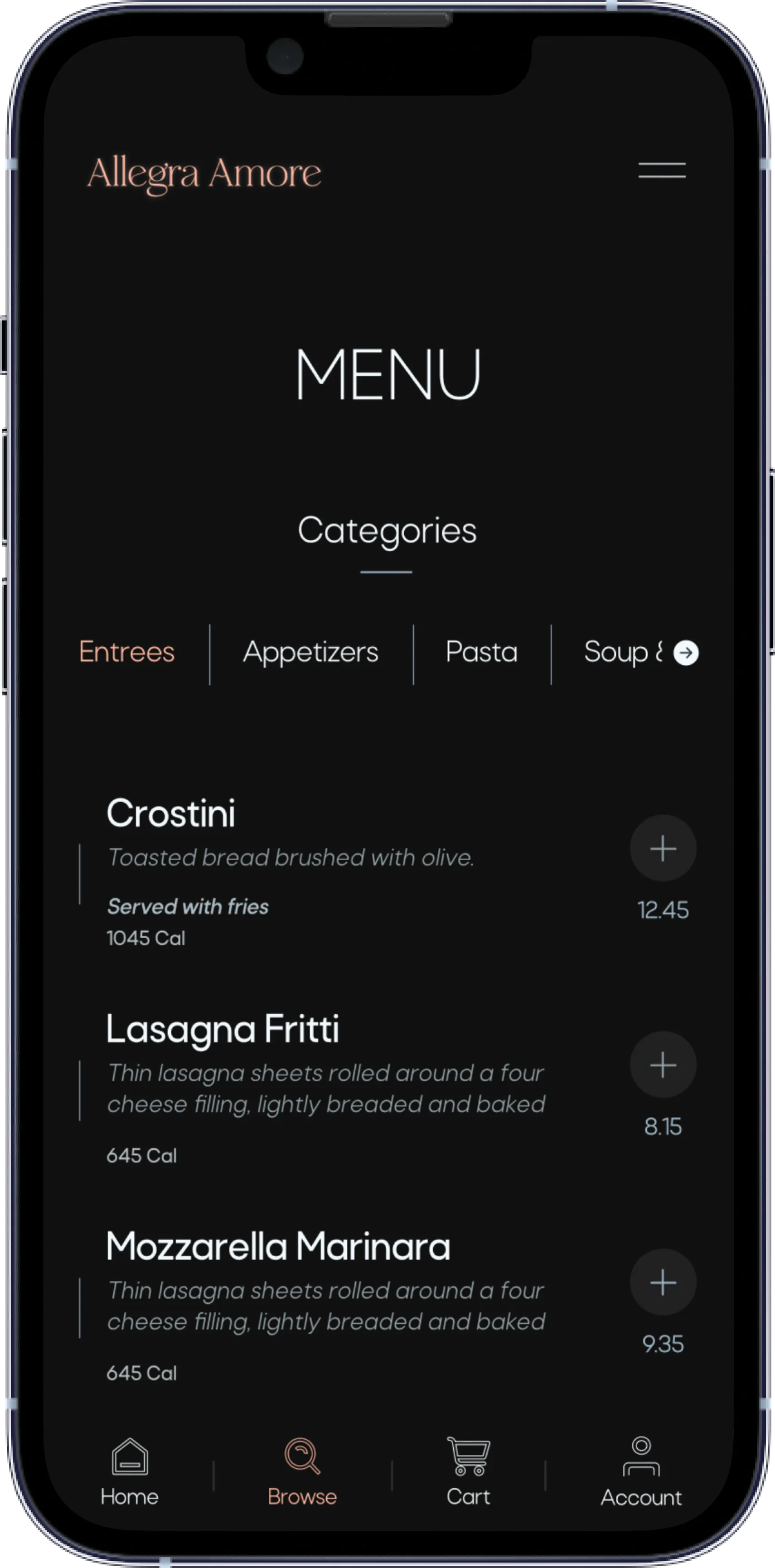
From these paper wireframes I continued to make digital wireframes that were easy to use and encouraged the main user flow.
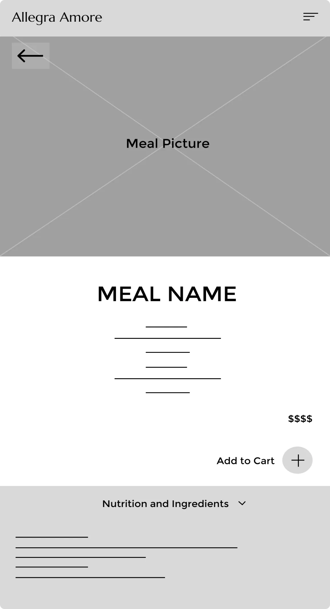
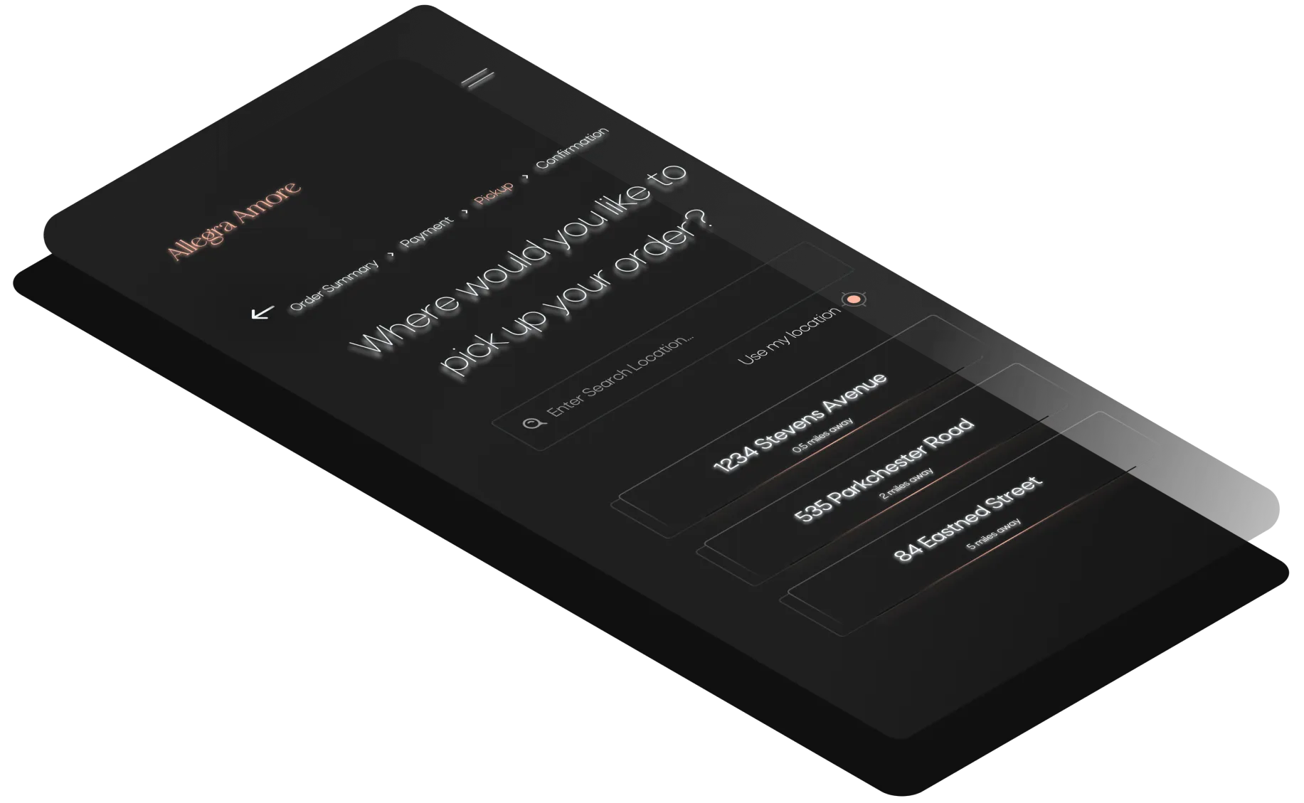
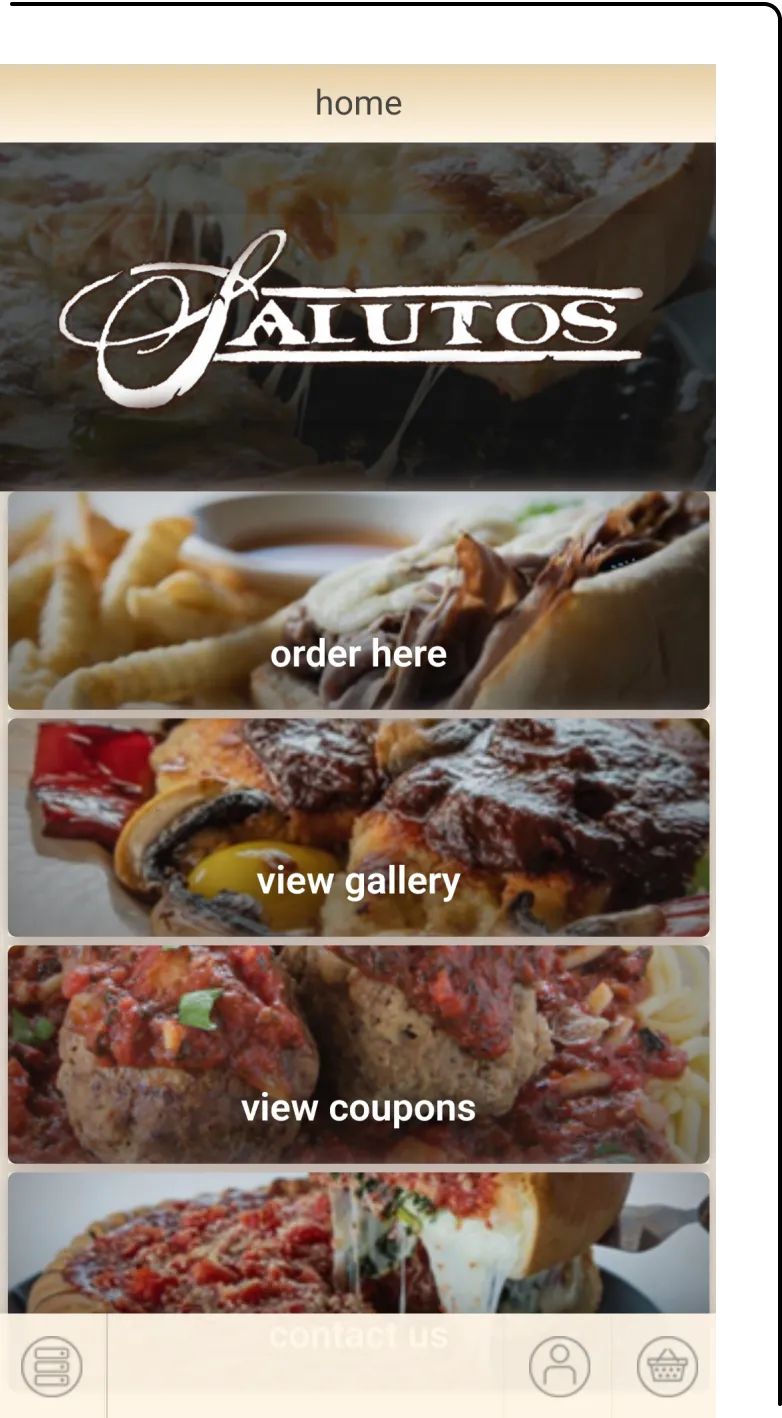
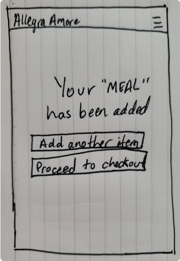
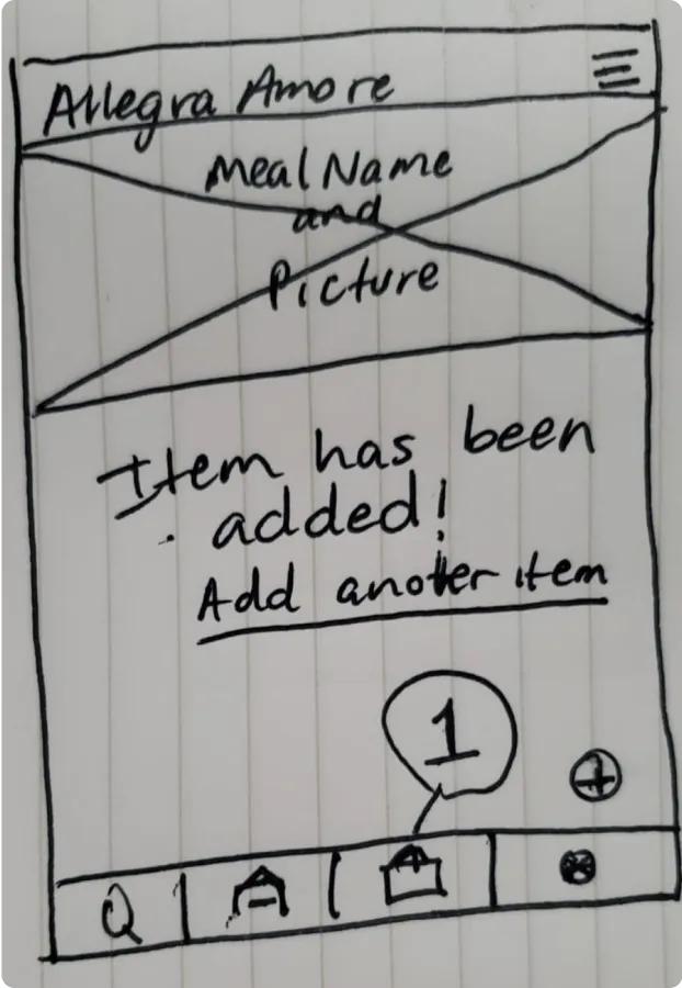
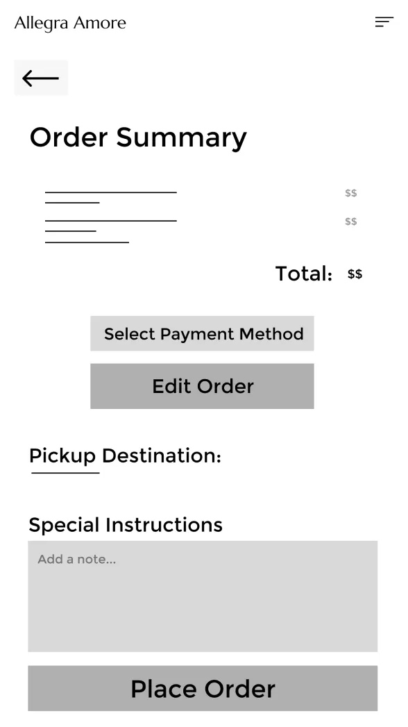
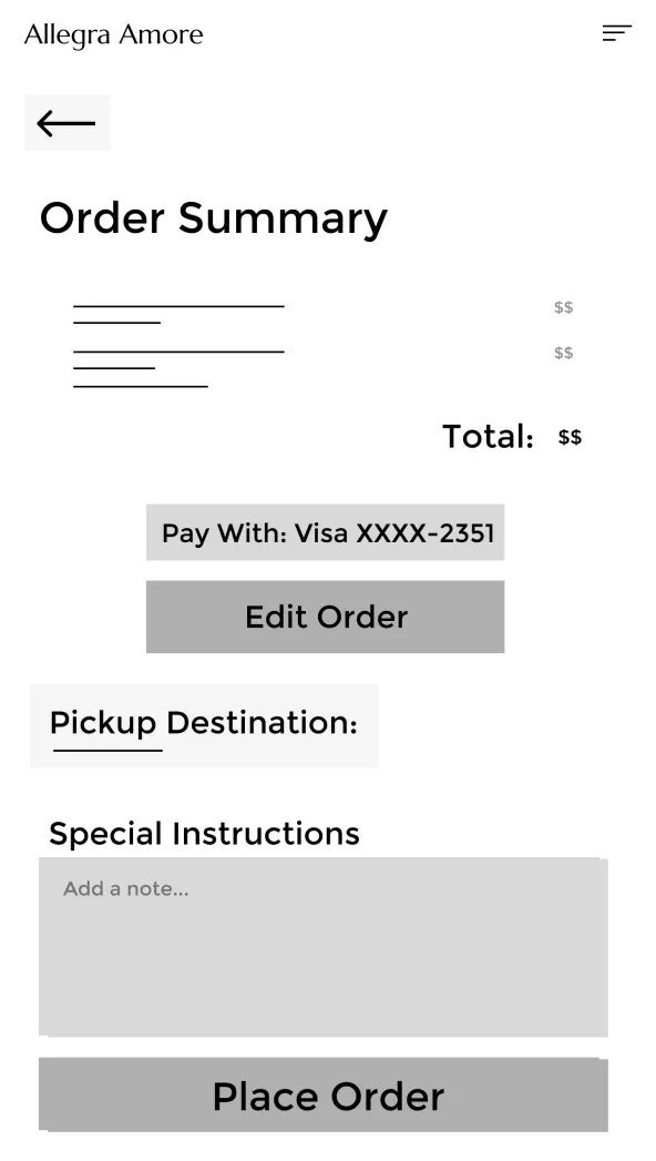
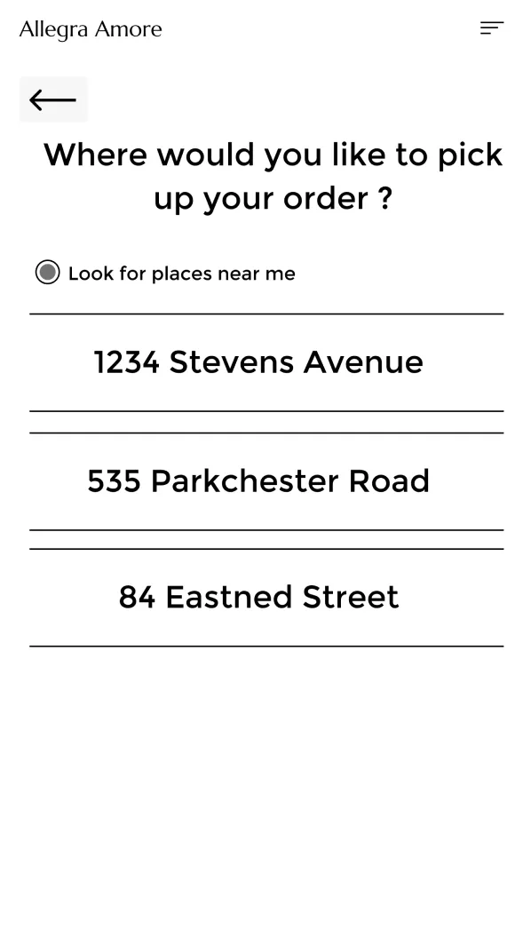
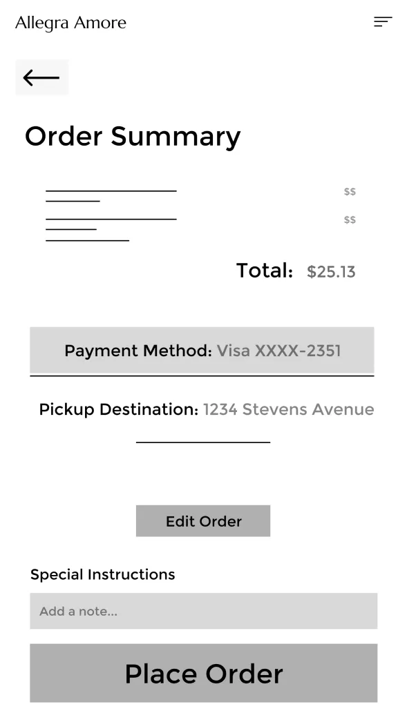
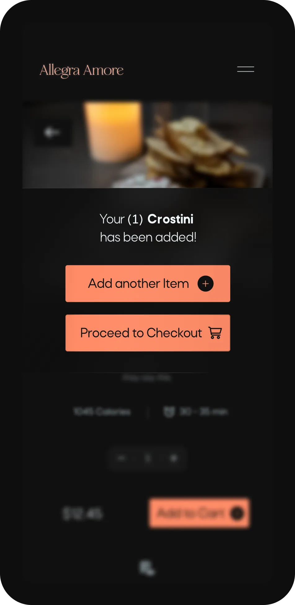
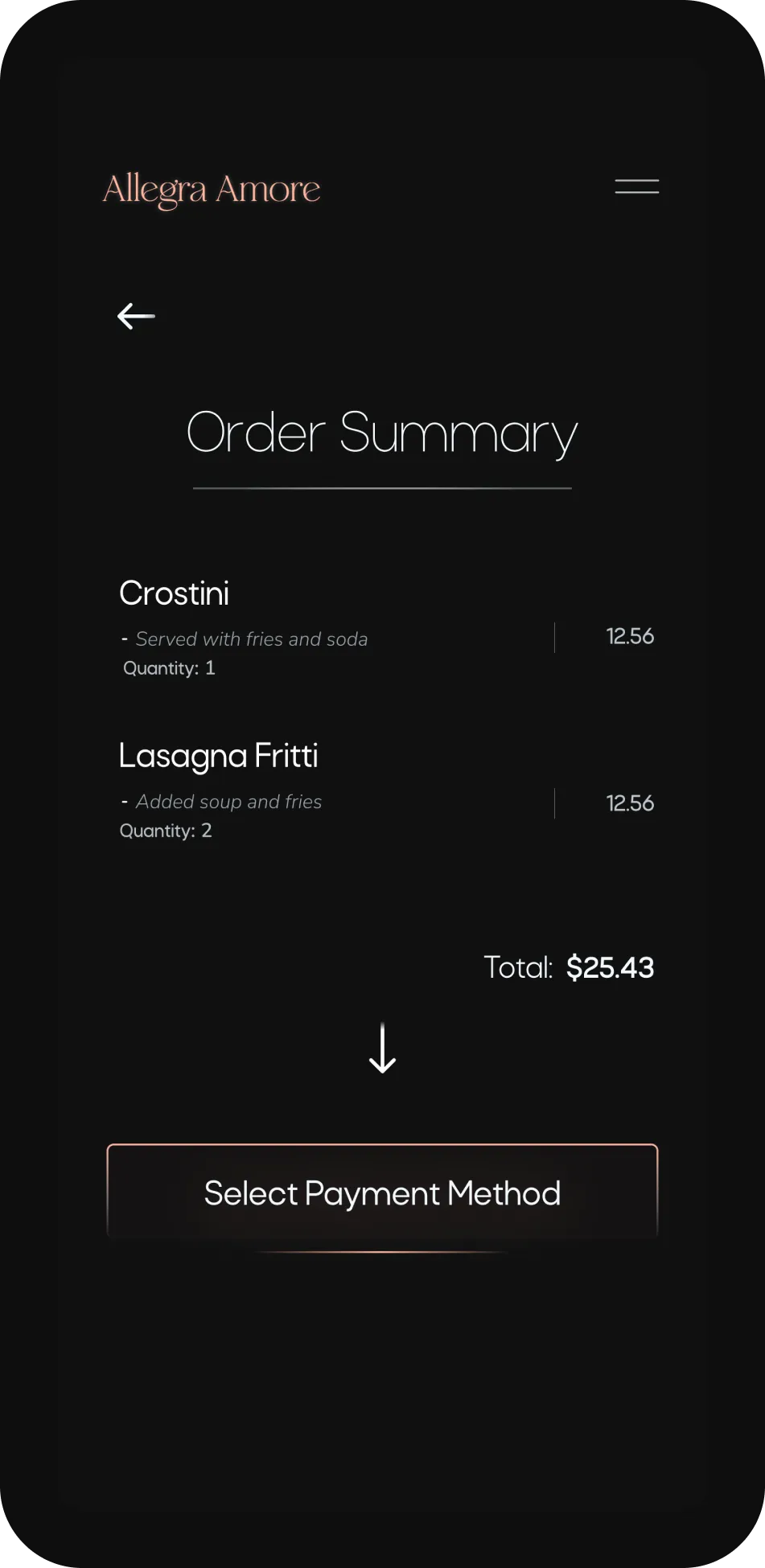
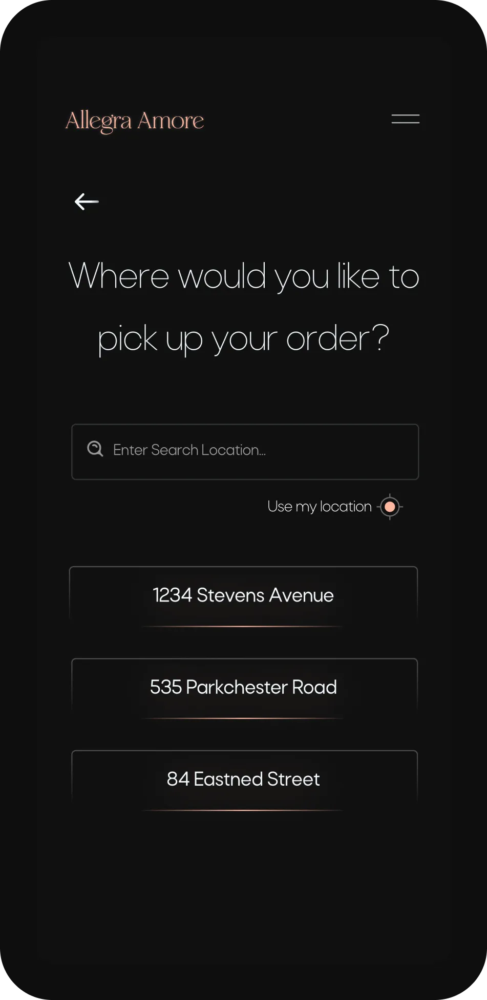
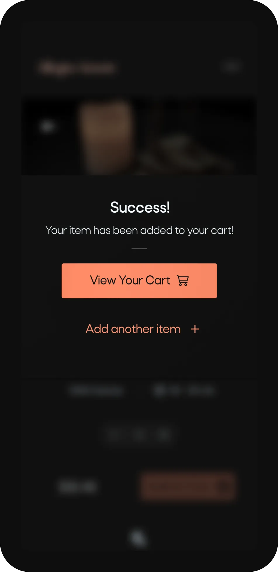
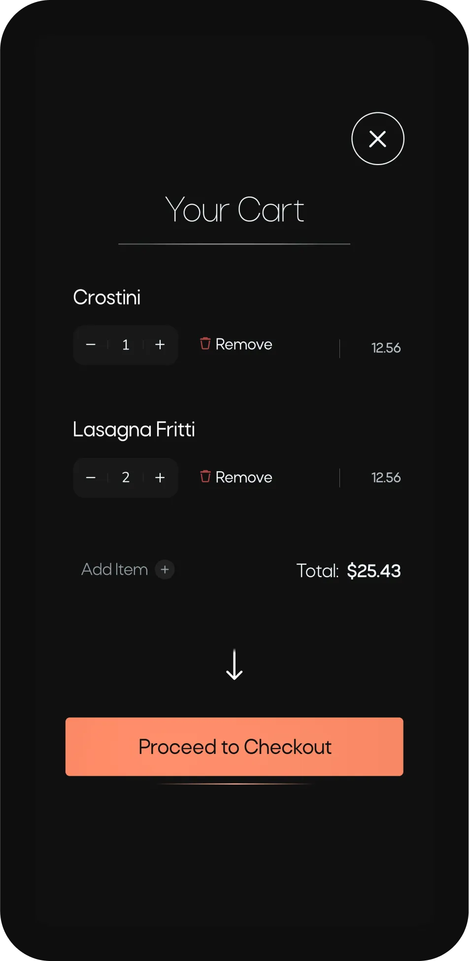
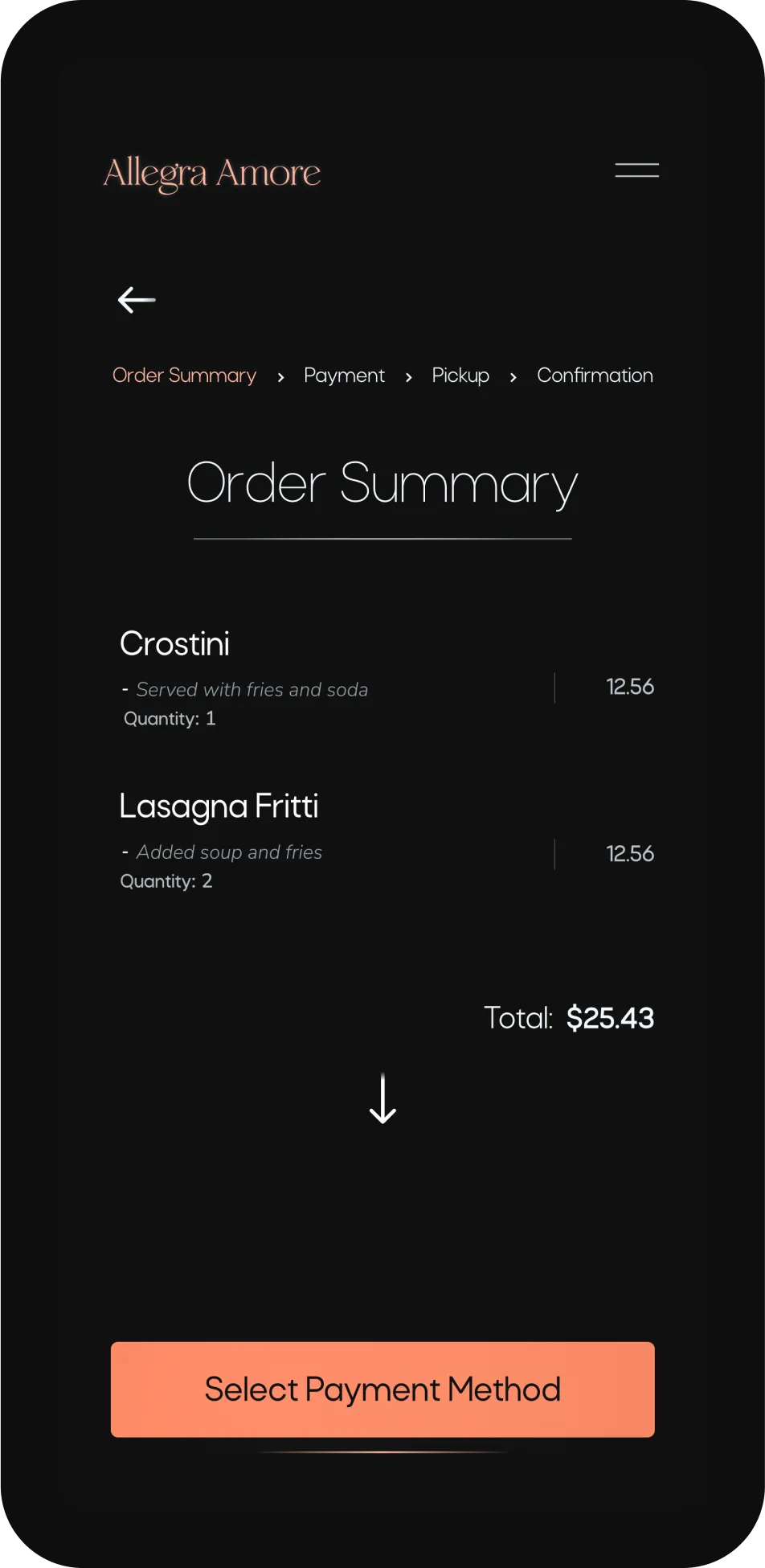
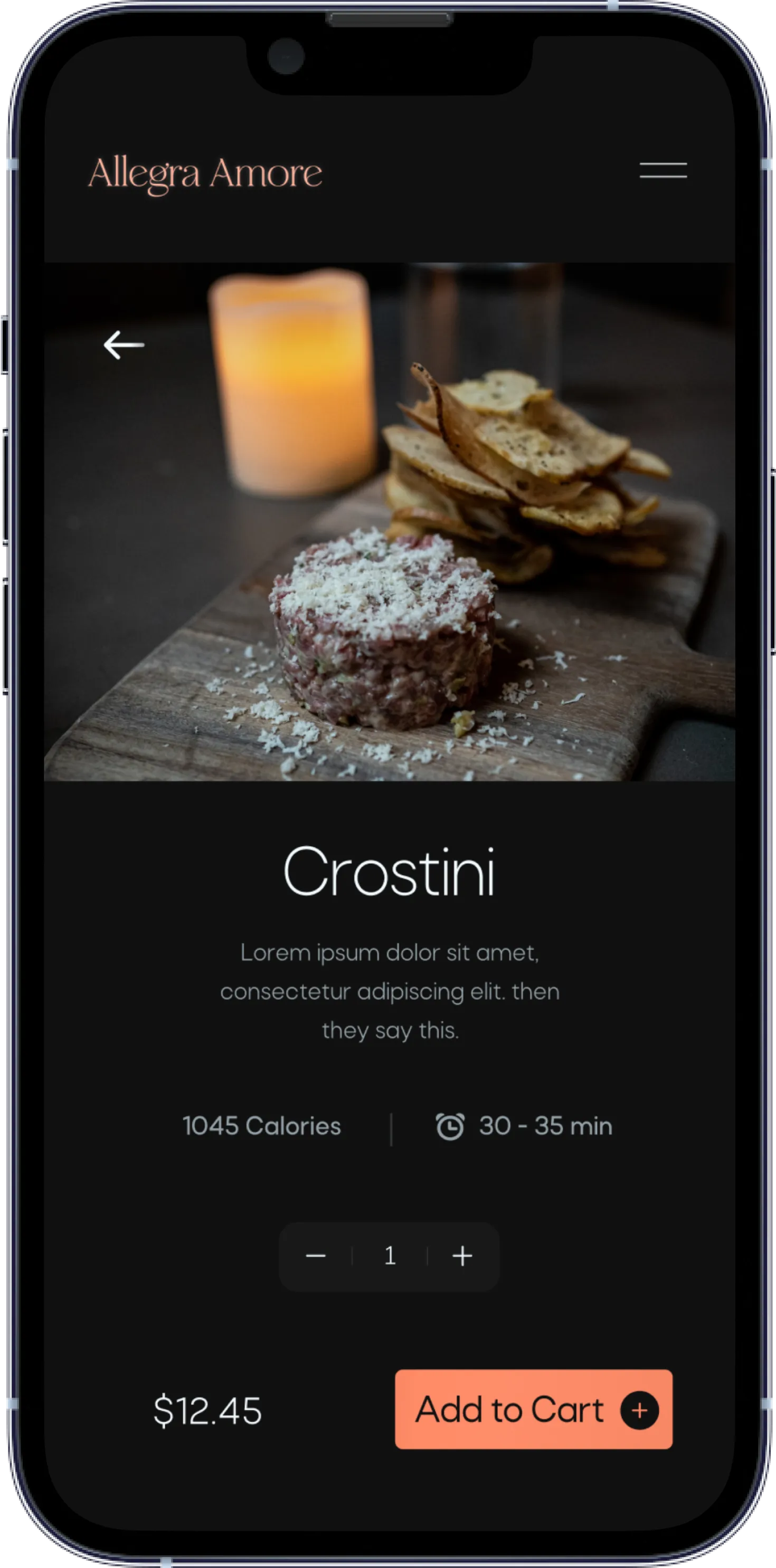
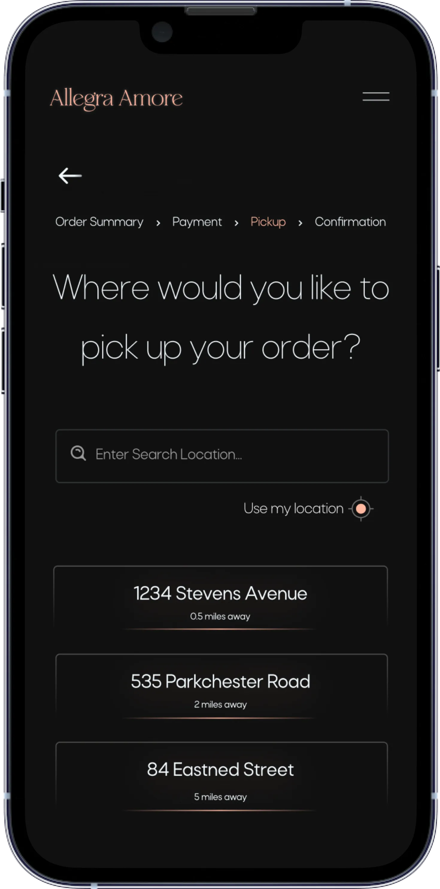
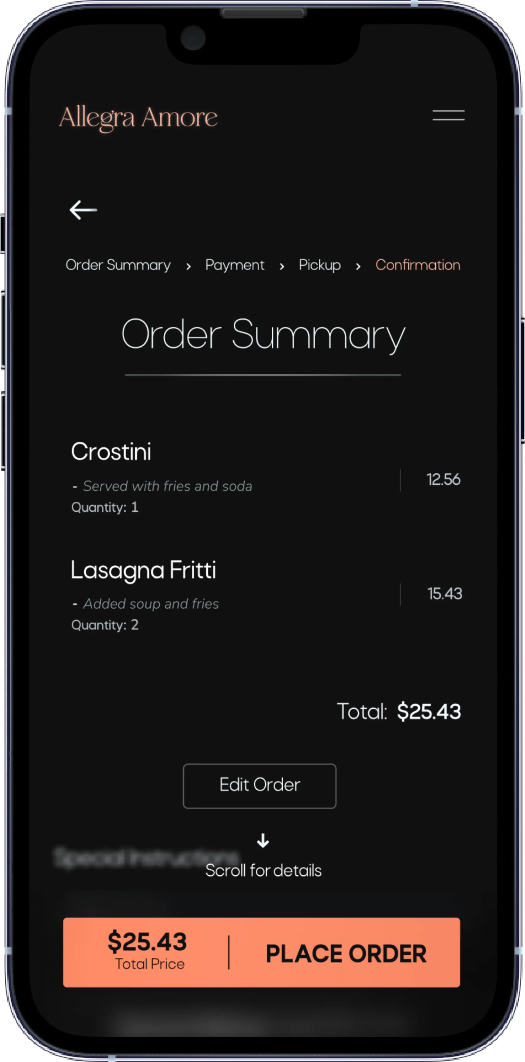
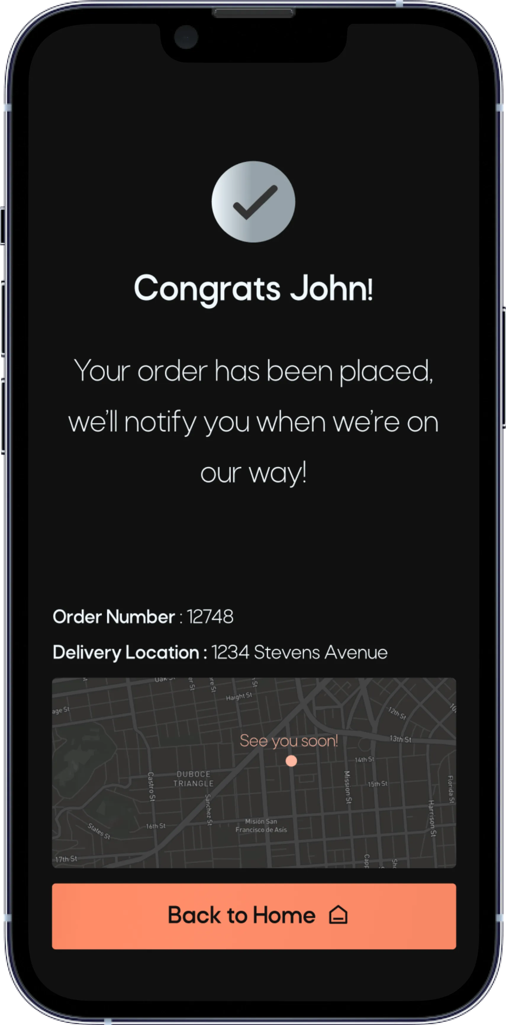
After creating my low-fidelity prototype I was excited to begin testing. This prototype allows you to add an item to cart, select payment method, pickup destination, and place order to complete the checkout process.
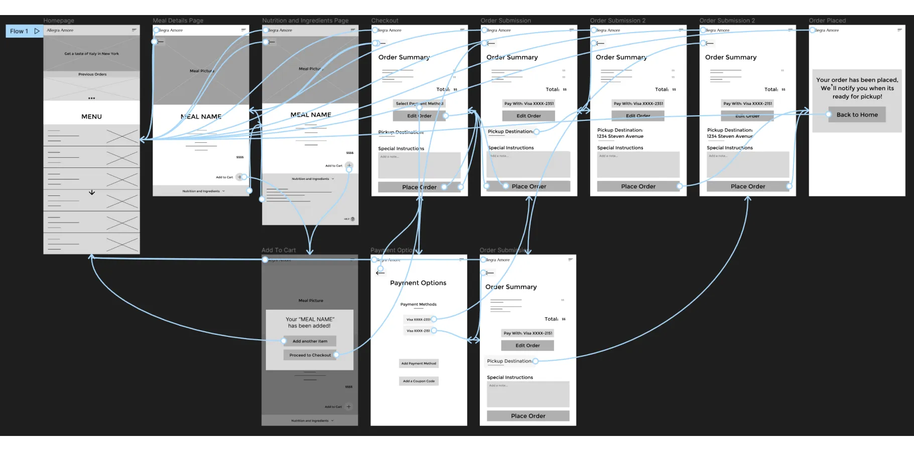
After creating my low-fidelity prototype I was excited to begin testing. This prototype allows you to add an item to cart, select payment method, pickup destination, and place order to complete the checkout process.
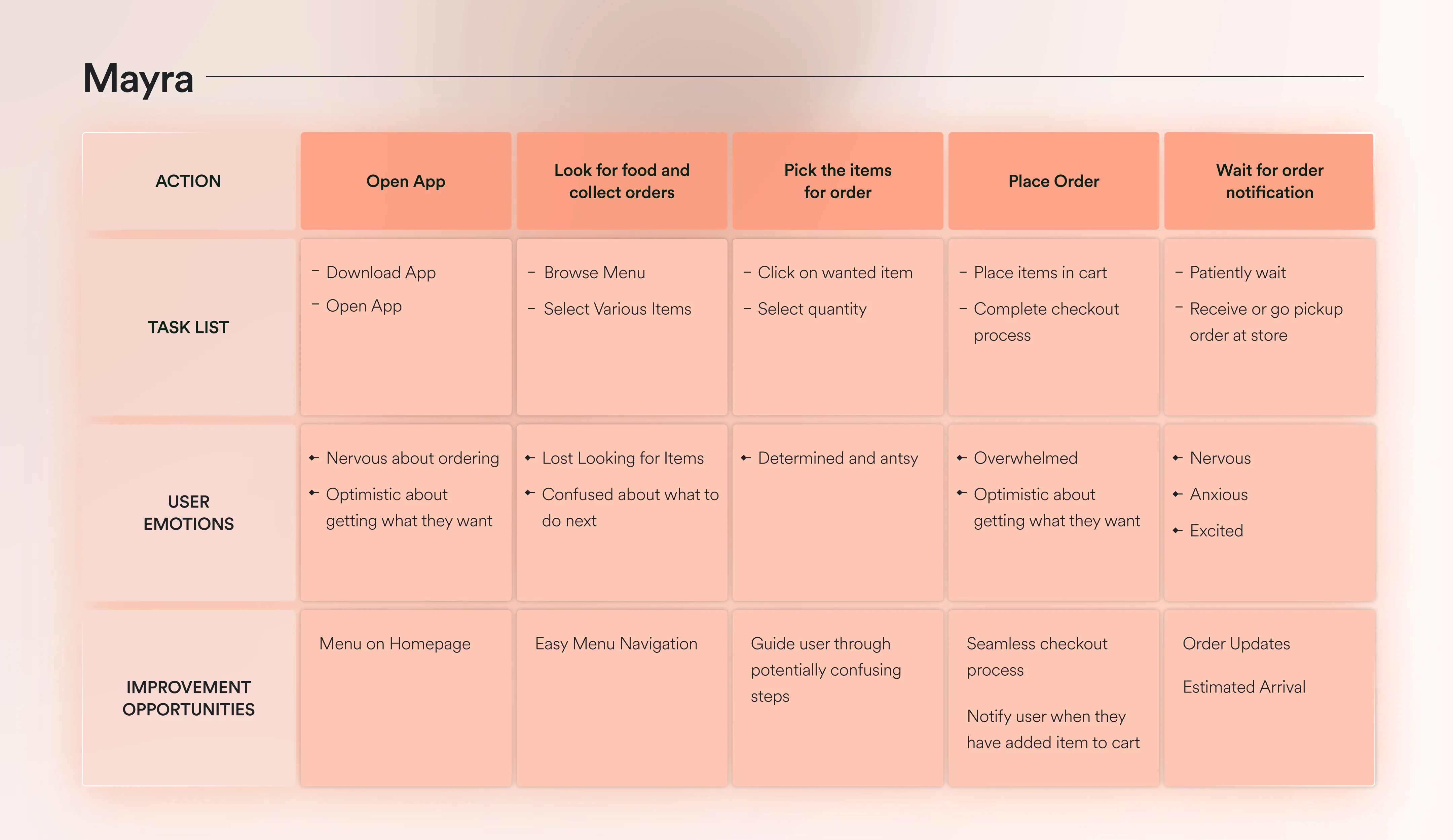
I conducted two rounds of usability studies with five participants to further discover pain points and user needs. I used high and low-fidelity prototypes for my studies and created affinity diagrams to synthesize my results.
The findings that I came to not only helped me improve the design, but it helped me understand first-hand why users were having the problems they were having. Getting into the mind of the users was essential in improving the design.


After the feedback I received it was back to the drawing board. I had only one thought in my mind after these tests...simplify. I had underestimated how much my participants didn’t know and for sure thought they were going to be able to complete the prompts.
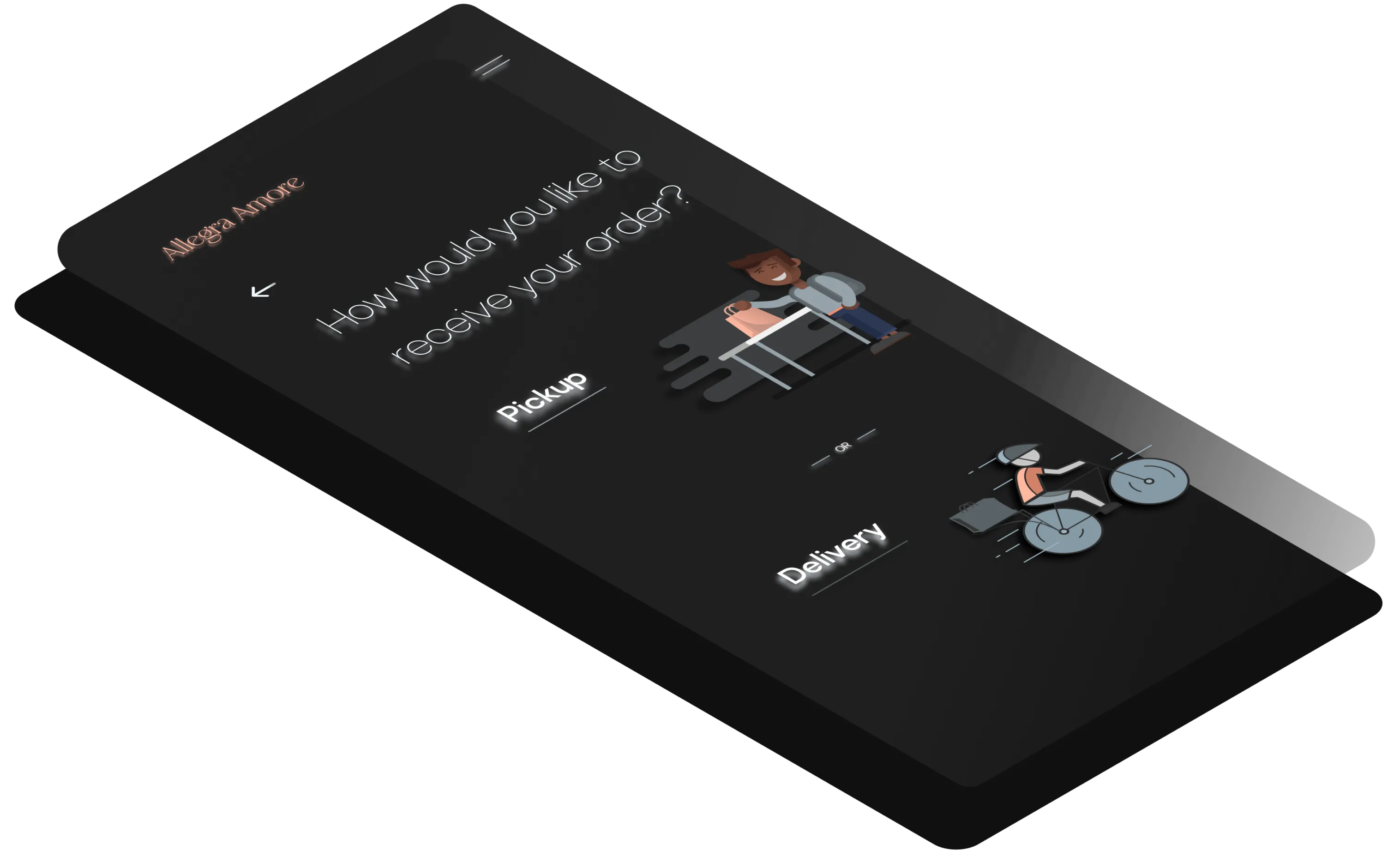
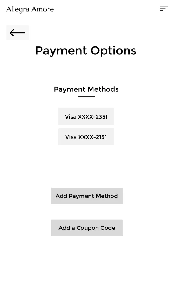
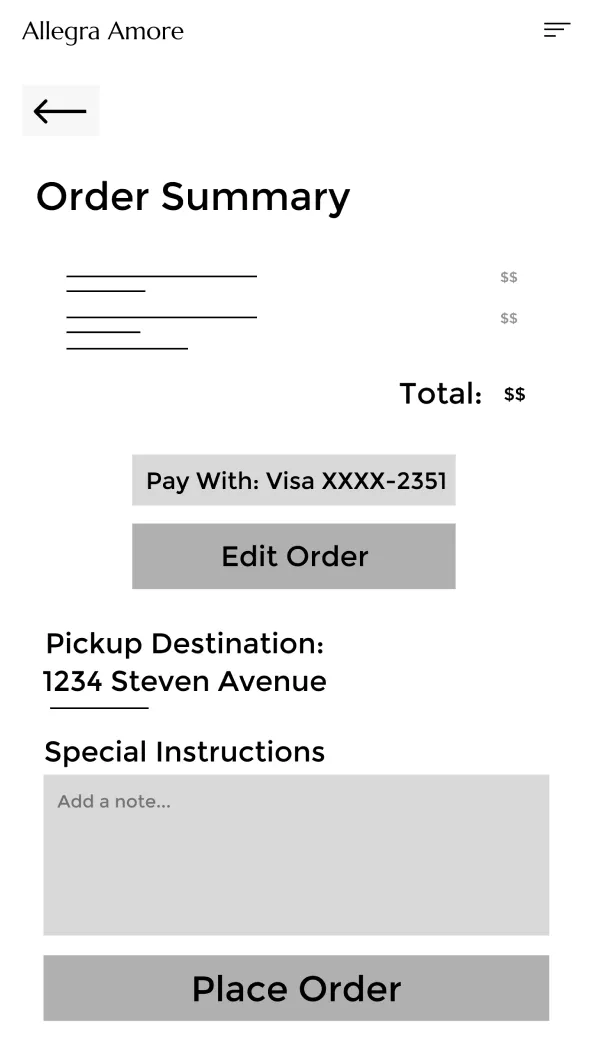
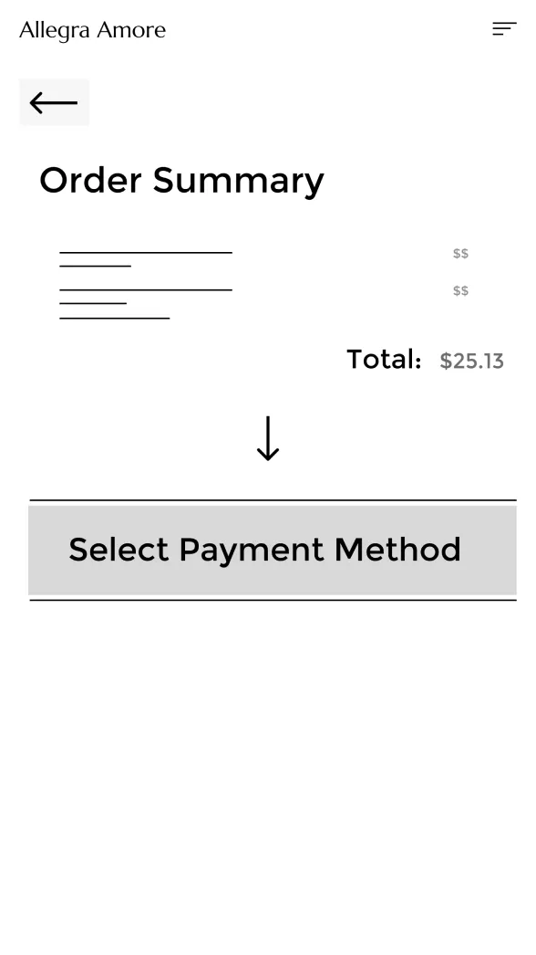
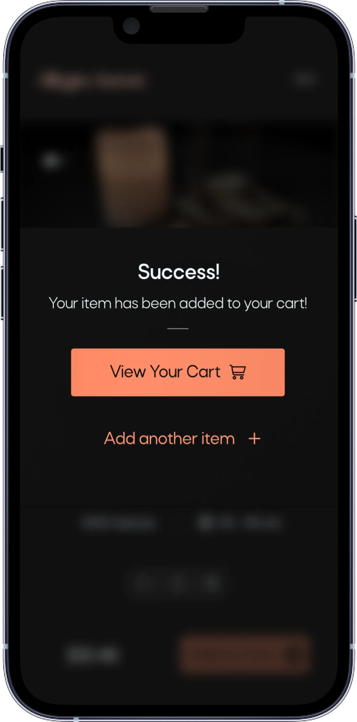
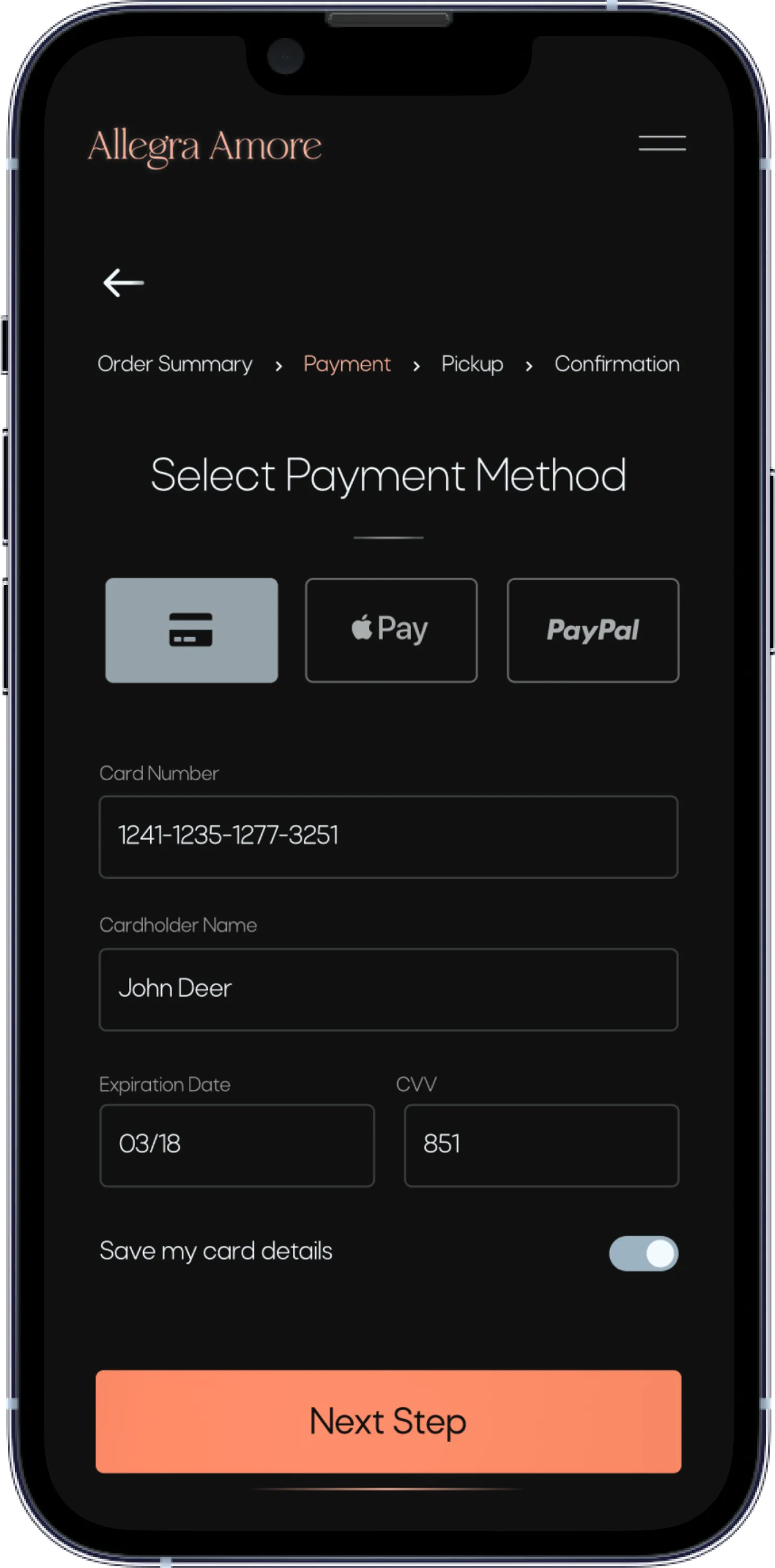
I continued to iterate the design and decided to introduce the checkout process step-by step instead of first introducing the order summary screen and letting the user figure it out on their own. I made each step in the process its own page so that that user is not overwhelmed with a text heavy screen. I also gave buttons more emphasis to encourage the user flow and increase conversion.

On round two of my usability studies the user experience had improved. Hearing the words “Oh wow that was so much easier than last time” was quite satisfying. All the research that I had done paid off and although the app became easier for some participants, that didn’t mean there weren’t any new problems that arose.
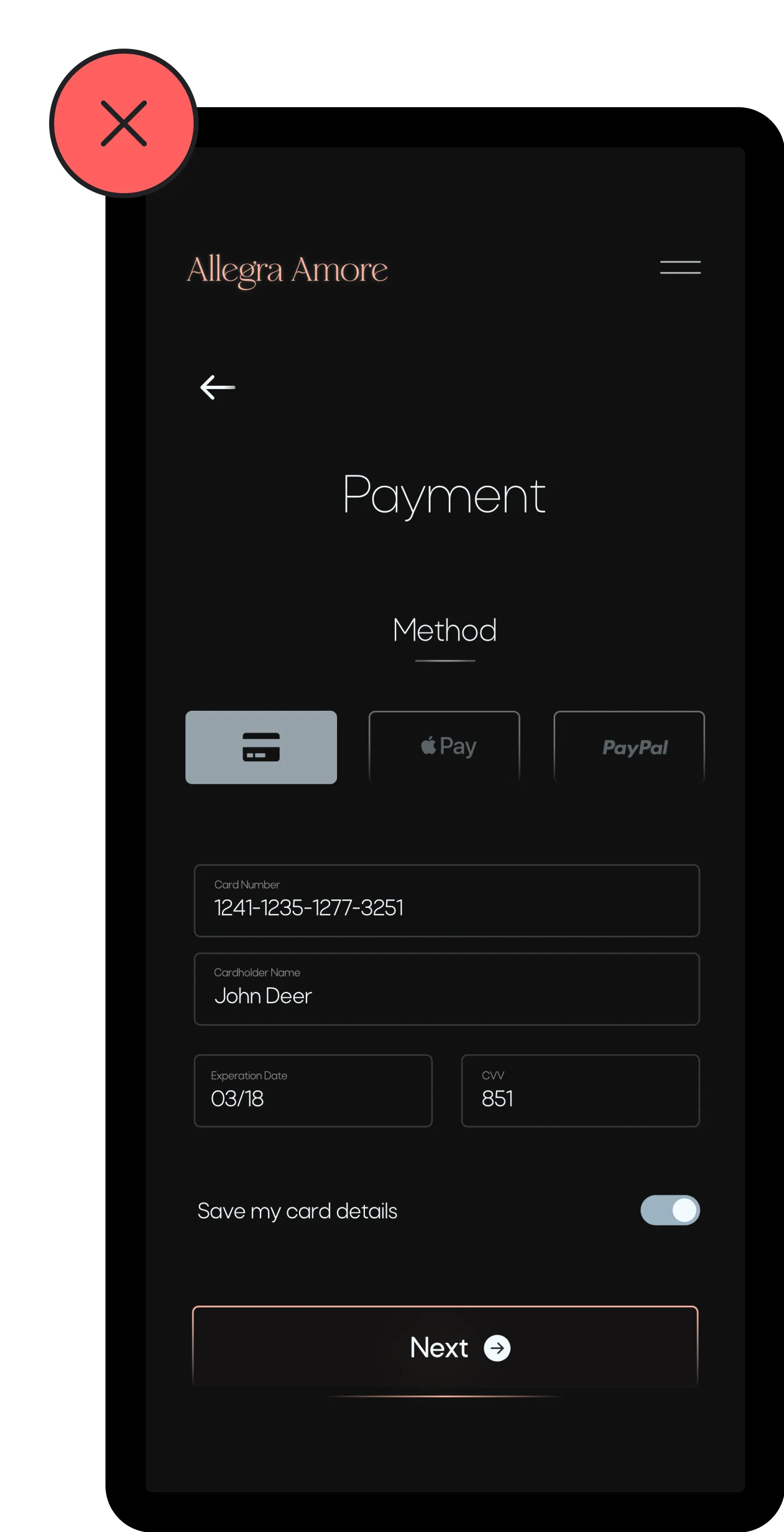
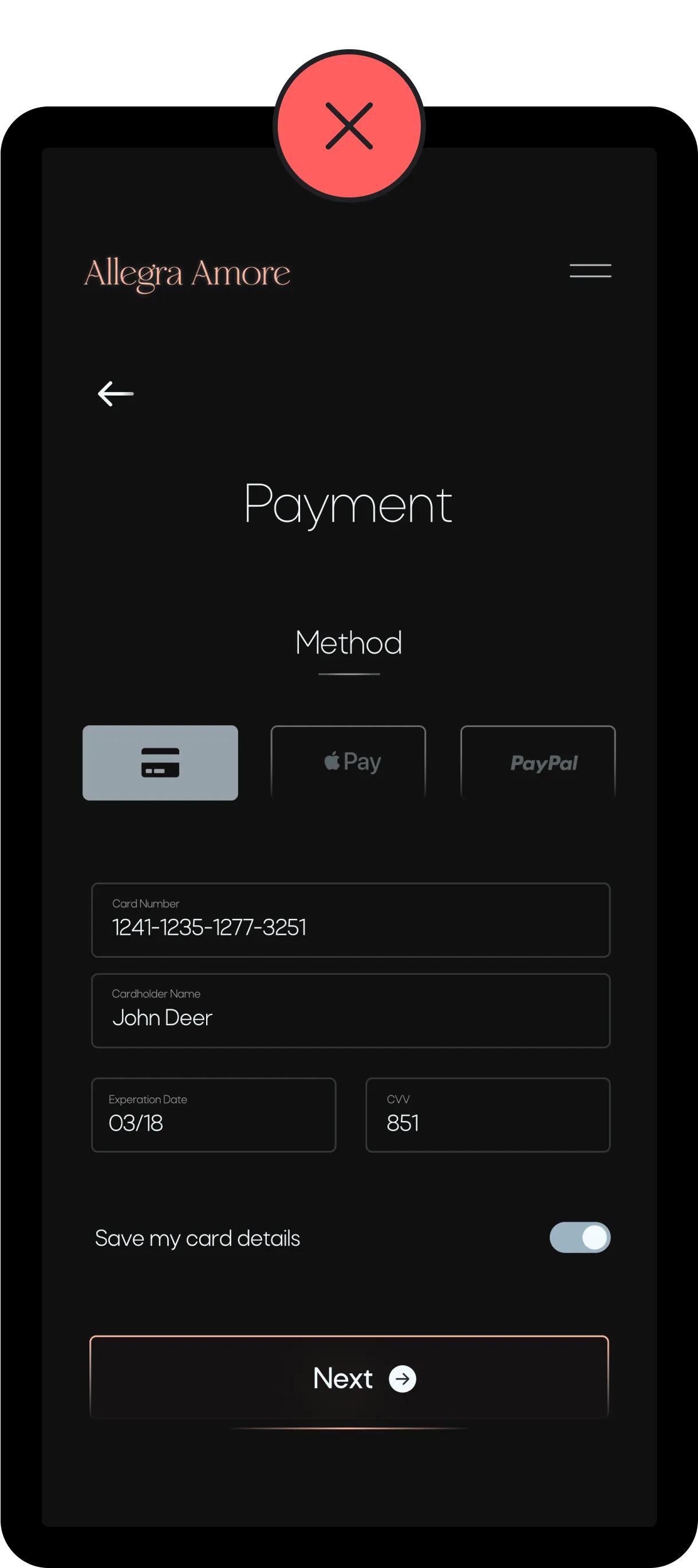
During iterating my designs I trapped myself in the aesthetics of the experience and overlooked certain UX principles in order to appease my visual pleasure. This led to me not adding enough emphasis on certain buttons (as you saw above) just because it “looked better”, potentially decreasing conversion rates. With newfound awareness of these mistakes I was able to improve the designs further.
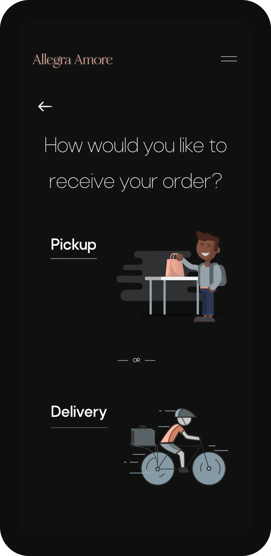
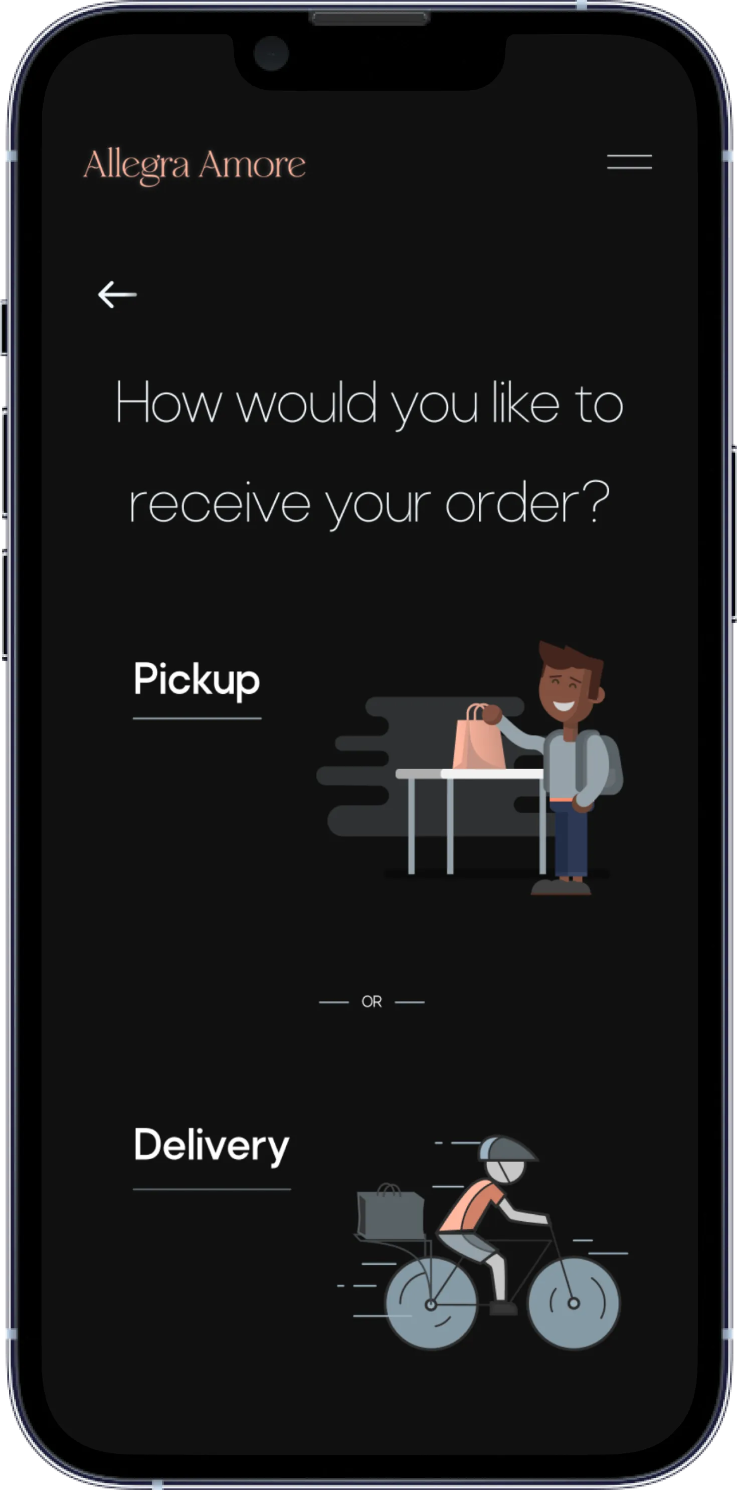
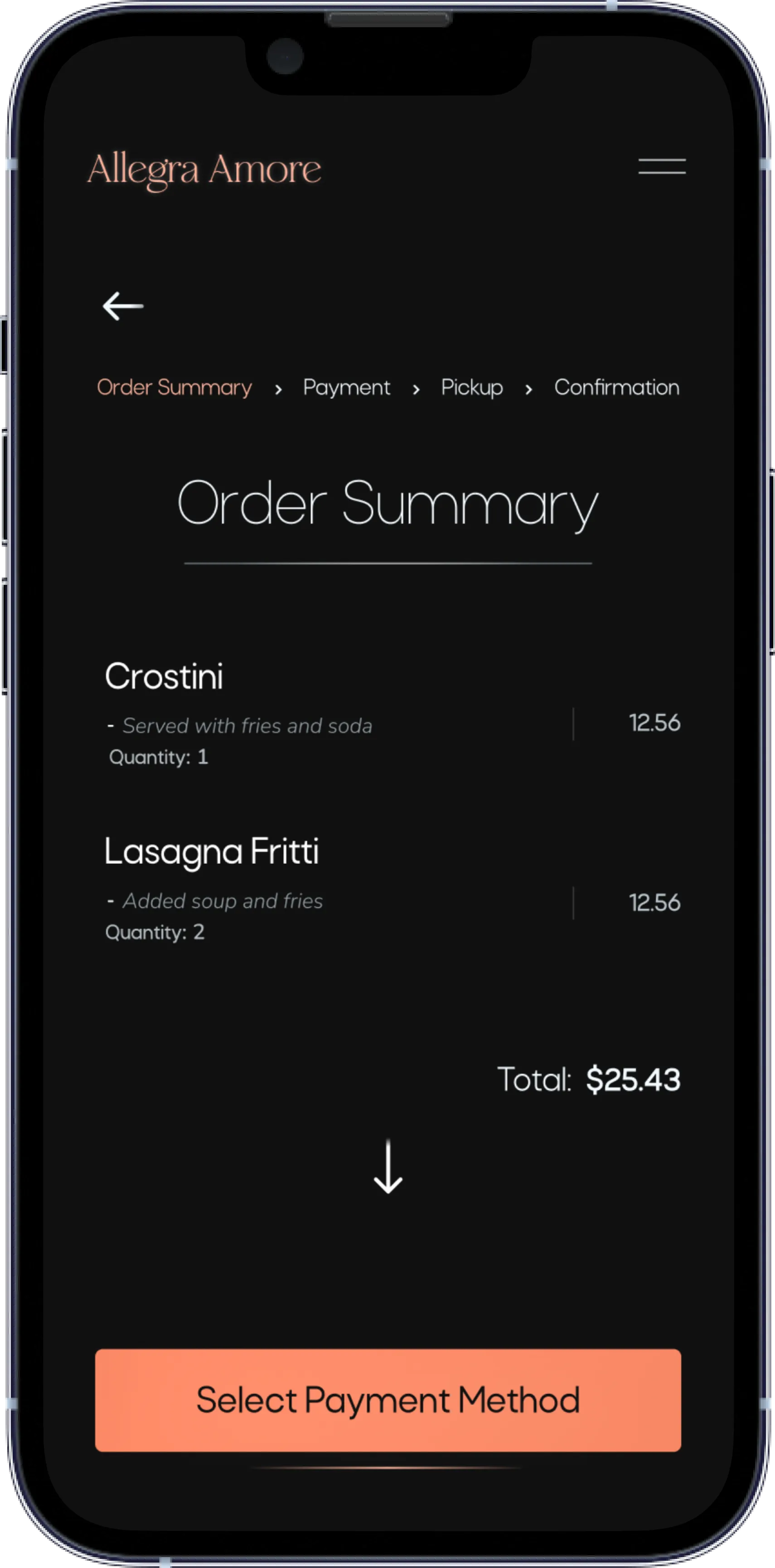
I continued to iterate the design based on my findings which consisted of improving the copy on the payment page , giving users a delivery option, and making it clear to the user if their order is for deliver or for pickup.
.webp)
-1.webp)
.webp)
-1.webp)
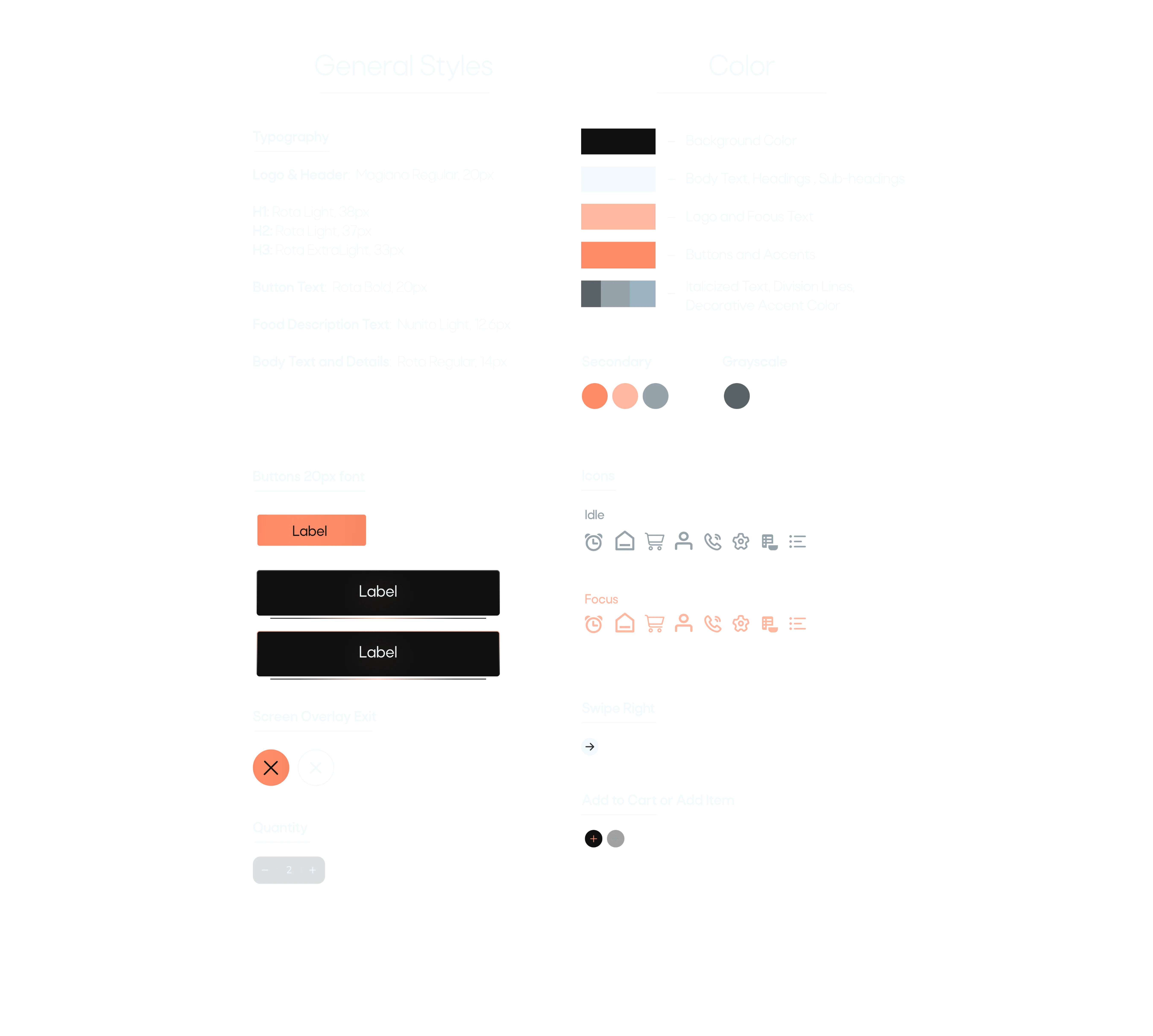
On this project I considered various principles in design to increase accessibility. Principles such as contrast, font size, scale and hierarchy all helped me increase legibility, learnability, satisfaction and last but not least provide an experience that was not only memorable but functional.
For the look of the app I decided to go for a darker theme for better contrast on brighter colors. The dark theme, typefaces, icons and choice of colors gives the restaurant a sophisticated look enhancing the experience.
I wanted a modern approach to the typical fonts you see at your local Italian restaurants, so I went with a font that almost resembled script but at the same time being very legible and sleek. For the body text I went for a sans serif that just tied it all together. Both fonts worked very well together and provided a consistent theme throughout the app.


After addressing as many user needs and pain points that I could discover to improve upon, it was time to say goodbye (for now). During this project I learned to not fall in love with your designs because in mere seconds of testing you’ll learn that you’re probably going to have to change whatever that fixation of yours may have been.
Truly I believe that I have accomplished what I set out to do. Targeting users who were not too knowledgeable in food ordering apps also helped make a positive impact on more experienced users.
My next steps on this project are to keep testing and iterating on the design to discover if there are new areas of need for the user. This was an exciting journey with turns and twists that I didn’t expect but nonetheless I can’t wait for the next one.