HOWTOCPR

How I provided an easy to use resource to learn CPR.
Role: UI/UX Designer, Visual Designer
Timeline: 4 Months (Jun - Sep 2023)

Overview

“HOWTOCPR” is an app and responsive website that provides users with easy access to learn how to give CPR.  This resource will be able to be used by new people learning CPR and people who already know CPR who want to brush up on their skills.

My Design Process

The Problem

With a very limited amount of options of apps that teach CPR, I saw the need to provide a better resource that could be used by young to older adults to quickly learn CPR and practice their skills.

The Goals

1

Figure out what difficulties users have understanding how to give CPR

2

Design a modern eye pleasing UI that encourages happy path user flows

3

Create a resource that teaches users step by step how to give CPR

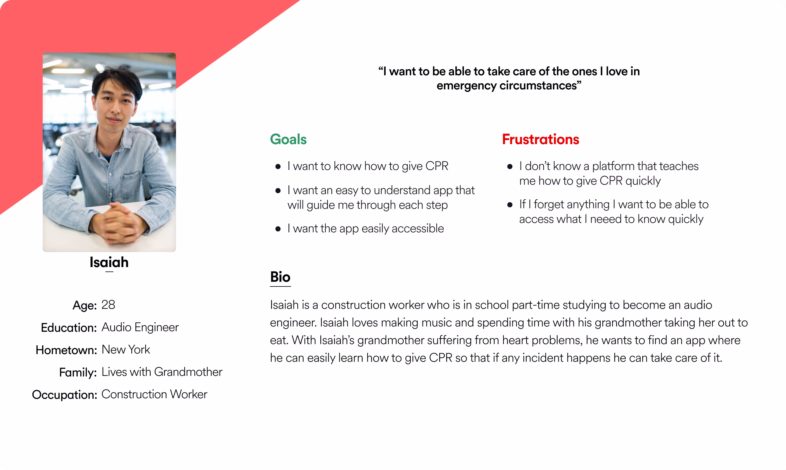
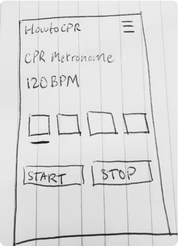
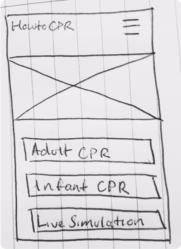
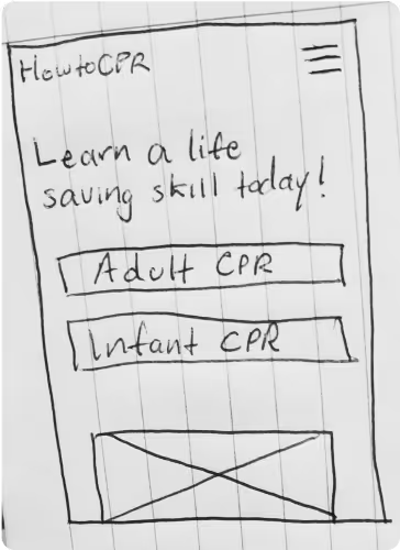
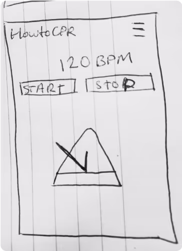
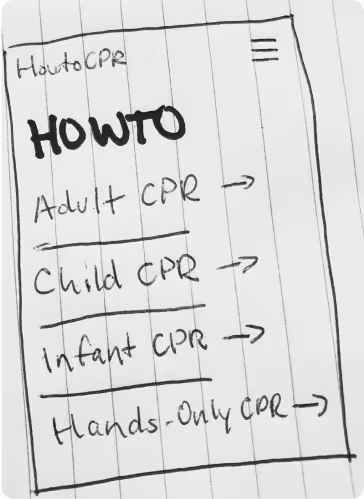
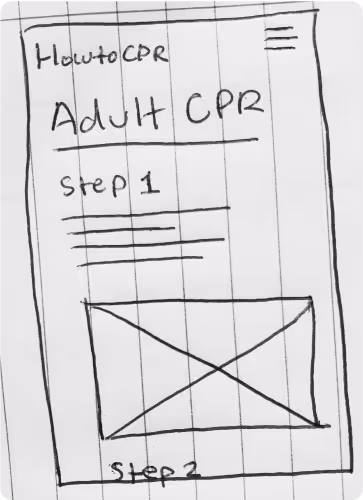
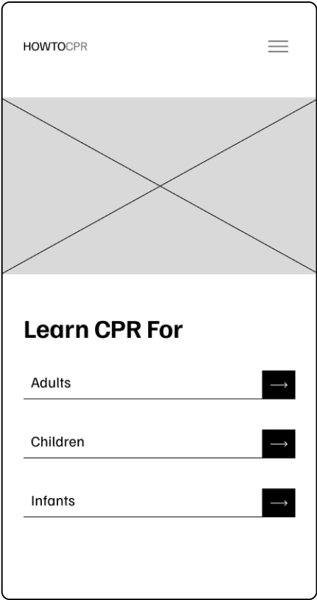
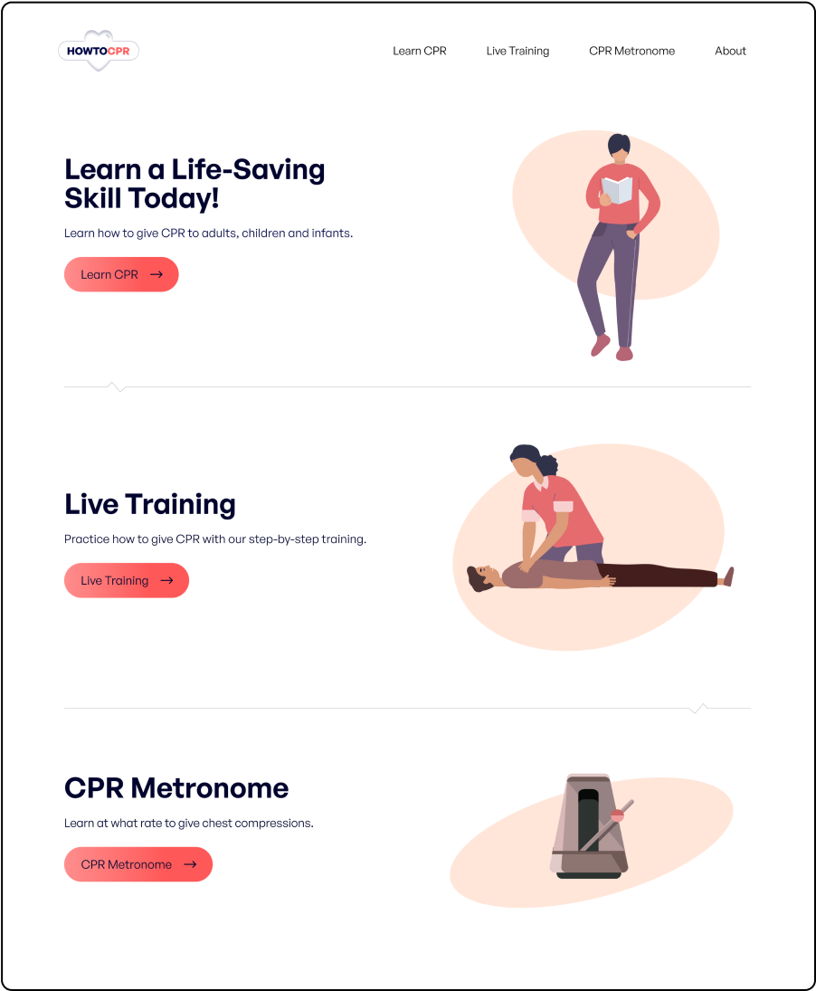
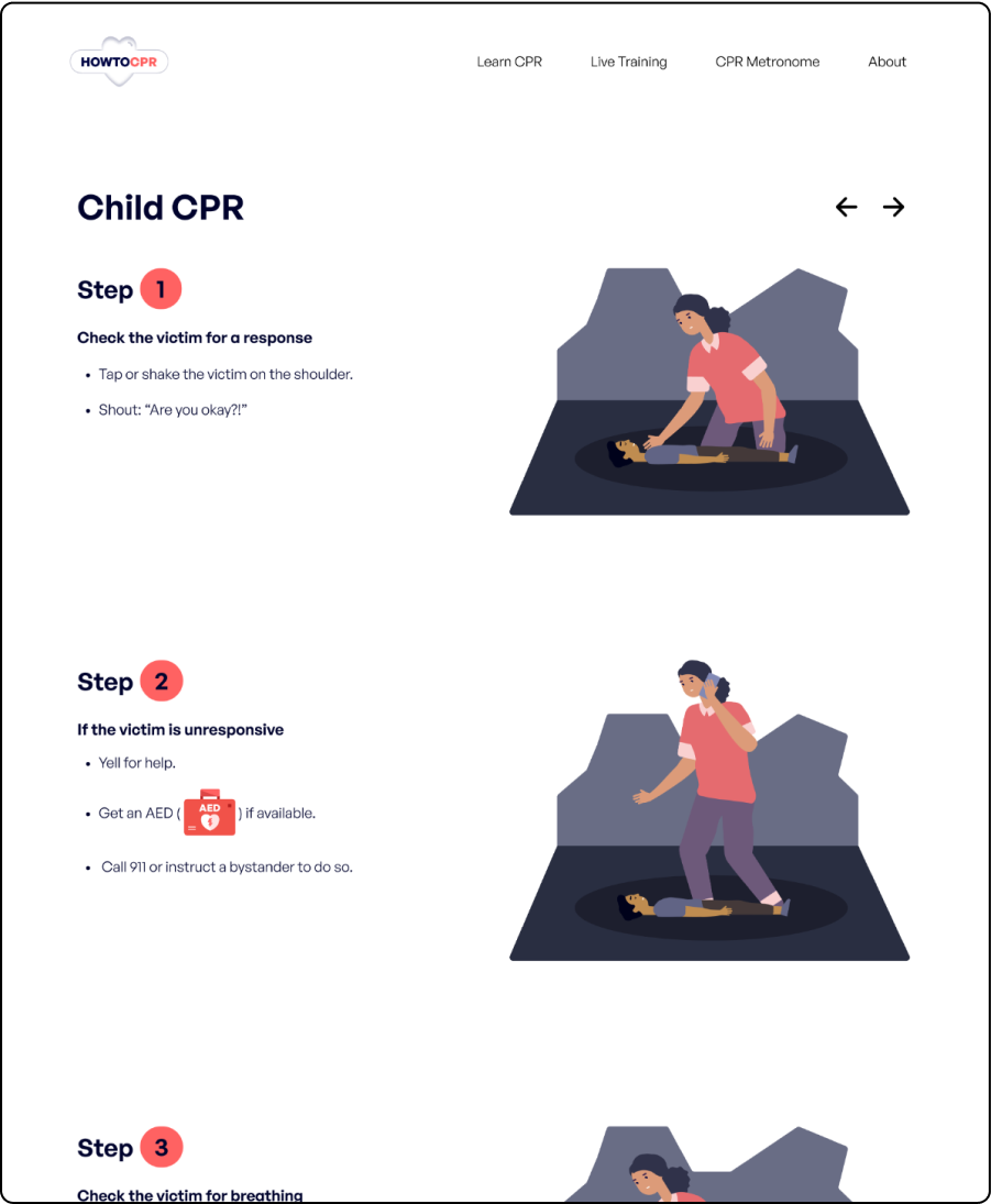
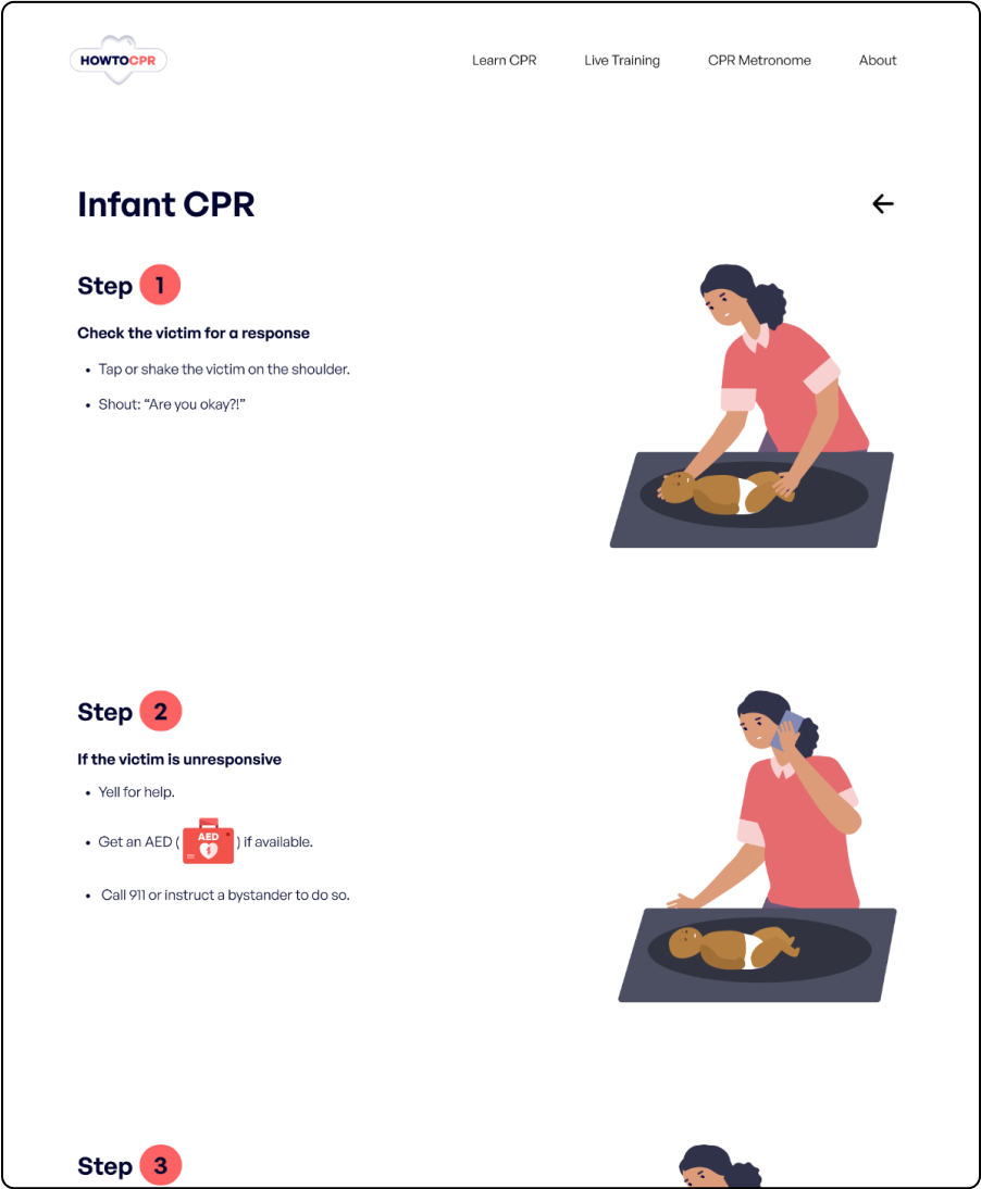
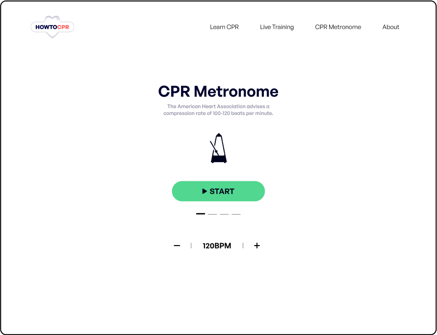
Understanding The User

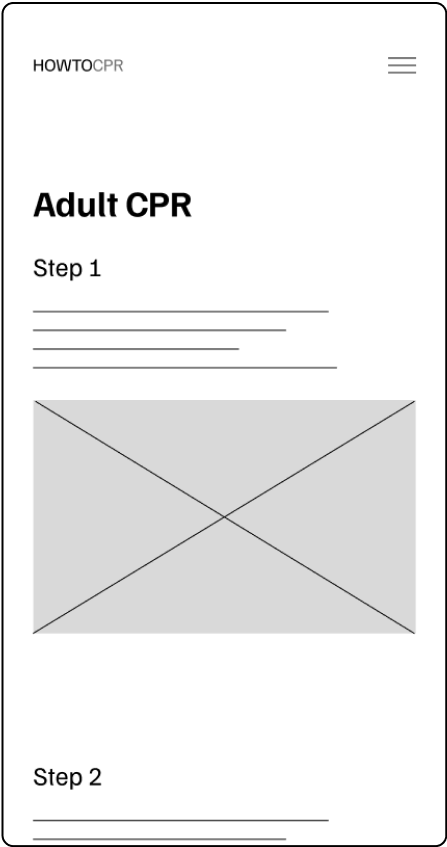
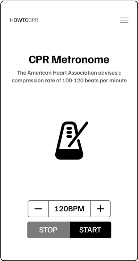
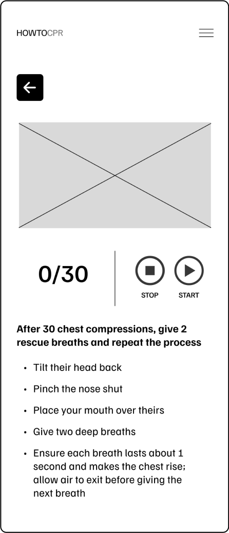
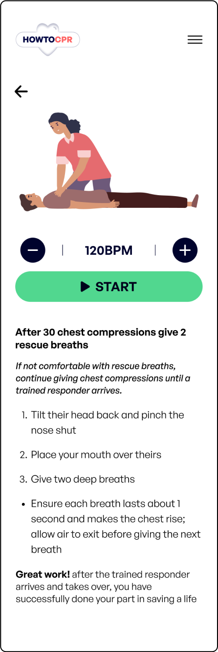
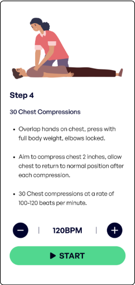
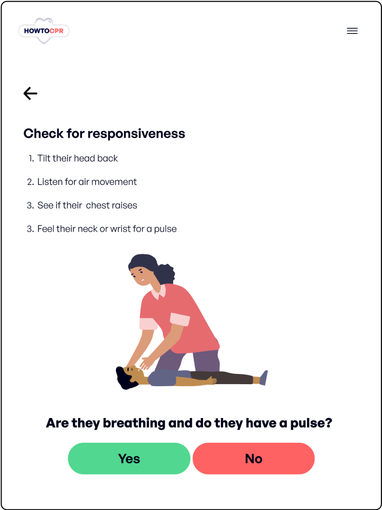
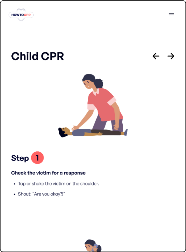
In order to understand the user and their needs, I used qualitative research methods. This consisted of user interviews, personas, usability testing and user stories. After conducting user interviews I discovered that users wanted detailed information on what to do while giving CPR, live images or videos, and live instructions to be able to practice CPR.

User Pain Points

1

Interaction

Users are having trouble understanding the dog adoption process

2

Interaction

Users aren’t able to compare dogs they like with each other to make a more informative decision faster

3

Experience

Users dont have enough information about the dog to make their final decision

Persona:  Isaiah

Problem Statement:

Isaiah is a construction worker living with his grandmother who needs an app to learn how to give CPR because he wants to be able to handle any emergency that might happen with his grandmother.

Starting the Design

After I empathized with users to define their users needs and pain points, I sketched out wireframes that I felt best addressed the users goals and frustrations.

Paper Wireframes

For the homepage I chose the paper wireframe that brought you to your desired function the fastest. I also worked on the designs for additional screen sizes to ensure responsiveness.

Digital Wireframes

I moved from paper to digital and added various elements that addressed the users needs and pain points.

1

Home page with easy access to CPR instructions by category

2

Built in metronome for tracking speed while giving CPR

3

Live training to give thorough directions with images or videos

Usability Study

I conducted one round of usability studies with five participants to further discover pain points and user needs.  I used a low-fidelity prototype for my studies and created affinity diagrams to synthesize my results and iterate on my designs.

Study Type

Moderated Usability Study

Location

Philadelphia, PA

Participants

5 participants

Length

15-30 Minutes

Usability Study Findings

1

Interaction

Users need a more intuitive way to access the CPR metronome on the instructions page

2

Interaction

Users need a better cue on what steps to take after the live training

3

Experience

Users need a faster way to get to what they want from the homepage

Mockups

Based on the insights, I made changes to help the user in their decision of what dog to adopt by making the favorite button more visible and giving them the ability to compare dogs they’ve favorited to further inform their decision.

Final Designs

After gathering all of my user research through user interviews, personas, usability studies, I started working on the final designs.

Throughout this process, I considered various principles such as contrast, font size, scale and hierarchy which all helped me increase the accessibility of my website. providing an experience that was not only engaging but functional.

Visual Design

For the look of this app and designated website I decided to go for a more youthful appearing design in comparison to its competitors with a vibrant red and a font that was modern and fun while remaining educational. The colors, font and illustrations will help with keeping the user engaged while also increasing information retention.

High-Fidelity Prototype

My high-fidelity prototype features design changes made after usability studies addressing all user needs. Since users use the web from a variety of devices I created a tablet and desktop version so users have the most responsive experience no matter what device.

Final Mobile Designs

Final Desktop Designs

Takeaways and Next Steps

I am always surprised by the great feedback users give while running the usability tests. This experience always humbles me and makes me realize how no matter how much I think I know what the user wants and needs, I truly don’t until I run a usability test.

After iterating the designs our target users shared that the design was well made to the point they couldn’t think of anything else they needed. My next steps are to conduct more usability tests with other audiences and identify potential areas that could make the user experience even more effortless.